Android
Vista de texto
Buscar..
Introducción
Todo lo relacionado con la personalización de TextView en Android SDK.
Sintaxis
- TextView (contexto de contexto)
- (TextView) findViewById (int id)
- void setText (int resid)
- void setText (CharSequence text) // Puedes usar String como argumento
Observaciones
Intenta usarlo en diseño xml o programáticamente.
Textview con diferentes tamaños de textos
Puede archivar diferentes tamaños de texto dentro de una vista de texto con un intervalo
TextView textView = (TextView) findViewById(R.id.textView);
Spannable span = new SpannableString(textView.getText());
span.setSpan(new RelativeSizeSpan(0.8f), start, end, Spannable.SPAN_EXCLUSIVE_EXCLUSIVE);
textView.setText(span)
Personalización de TextView
public class CustomTextView extends TextView {

    private float strokeWidth;
    private Integer strokeColor;
    private Paint.Join strokeJoin;
    private float strokeMiter;


    public CustomTextView(Context context) {
        super(context);
        init(null);
    }

    public CustomTextView(Context context, AttributeSet attrs) {
        super(context, attrs);
        init(attrs);
    }

    public CustomTextView(Context context, AttributeSet attrs, int defStyle) {
        super(context, attrs, defStyle);
        init(attrs);
    }

    public void init(AttributeSet attrs) {

        if (attrs != null) {
            TypedArray a = getContext().obtainStyledAttributes(attrs, R.styleable.CustomTextView);

            if (a.hasValue(R.styleable.CustomTextView_strokeColor)) {
                float strokeWidth = a.getDimensionPixelSize(R.styleable.CustomTextView_strokeWidth, 1);
                int strokeColor = a.getColor(R.styleable.CustomTextView_strokeColor, 0xff000000);
                float strokeMiter = a.getDimensionPixelSize(R.styleable.CustomTextView_strokeMiter, 10);
                Paint.Join strokeJoin = null;
                switch (a.getInt(R.styleable.CustomTextView_strokeJoinStyle, 0)) {
                    case (0):
                        strokeJoin = Paint.Join.MITER;
                        break;
                    case (1):
                        strokeJoin = Paint.Join.BEVEL;
                        break;
                    case (2):
                        strokeJoin = Paint.Join.ROUND;
                        break;
                }
                this.setStroke(strokeWidth, strokeColor, strokeJoin, strokeMiter);
            }
        }
    }

    public void setStroke(float width, int color, Paint.Join join, float miter) {
        strokeWidth = width;
        strokeColor = color;
        strokeJoin = join;
        strokeMiter = miter;
    }

    @Override
    public void onDraw(Canvas canvas) {
        super.onDraw(canvas);

        int restoreColor = this.getCurrentTextColor();
        if (strokeColor != null) {
            TextPaint paint = this.getPaint();
            paint.setStyle(Paint.Style.STROKE);
            paint.setStrokeJoin(strokeJoin);
            paint.setStrokeMiter(strokeMiter);
            this.setTextColor(strokeColor);
            paint.setStrokeWidth(strokeWidth);
            super.onDraw(canvas);
            paint.setStyle(Paint.Style.FILL);
            this.setTextColor(restoreColor);
        }
    }
}
Uso:
public class MainActivity extends Activity {

    @Override
    protected void onCreate(Bundle savedInstanceState) {
        super.onCreate(savedInstanceState);
        setContentView(R.layout.activity_main);

        CustomTextView customTextView = (CustomTextView) findViewById(R.id.pager_title);
    }
}
Diseño:
<RelativeLayout xmlns:android="http://schemas.android.com/apk/res/android"
    xmlns:app="http://schemas.android.com/apk/res-auto"
    android:layout_width="fill_parent"
    android:layout_height="fill_parent"
    android:background="@mipmap/background">


    <pk.sohail.gallerytest.activity.CustomTextView
        android:id="@+id/pager_title"
        android:layout_width="wrap_content"
        android:layout_height="wrap_content"
        android:layout_centerHorizontal="true"
        android:layout_centerVertical="true"
        android:gravity="center"
        android:text="@string/txt_title_photo_gallery"
        android:textColor="@color/white"
        android:textSize="30dp"
        android:textStyle="bold"
        app:outerShadowRadius="10dp"
        app:strokeColor="@color/title_text_color"
        app:strokeJoinStyle="miter"
        app:strokeWidth="2dp" />

</RelativeLayout>
attars:
<?xml version="1.0" encoding="utf-8"?>
<resources>

    <declare-styleable name="CustomTextView">

        <attr name="outerShadowRadius" format="dimension" />
        <attr name="strokeWidth" format="dimension" />
        <attr name="strokeMiter" format="dimension" />
        <attr name="strokeColor" format="color" />
        <attr name="strokeJoinStyle">
            <enum name="miter" value="0" />
            <enum name="bevel" value="1" />
            <enum name="round" value="2" />
        </attr>
    </declare-styleable>

</resources>
Uso programático:
CustomTextView mtxt_name = (CustomTextView) findViewById(R.id.pager_title);
//then use
setStroke(float width, int color, Paint.Join join, float miter);
//method before setting
setText("Sample Text");
TextView de Spannable
Se puede usar un TextView TextView en Android para resaltar una parte particular del texto con un color, estilo, tamaño y / o evento de clic diferente en un solo widget de TextView .
Considere que ha definido un TextView siguiente manera:
TextView textview=findViewById(R.id.textview);
Luego puede aplicar diferentes resaltados como se muestra a continuación:
De color Spannable: Con el fin de establecer un color diferente a alguna porción de texto, un
ForegroundColorSpanse puede utilizar, como se muestra en el siguiente ejemplo:Spannable spannable = new SpannableString(firstWord+lastWord); spannable.setSpan(new ForegroundColorSpan(firstWordColor), 0, firstWord.length(), Spannable.SPAN_EXCLUSIVE_EXCLUSIVE); spannable.setSpan(new ForegroundColorSpan(lastWordColor), firstWord.length(), firstWord.length()+lastWord.length(), Spannable.SPAN_EXCLUSIVE_EXCLUSIVE); textview.setText( spannable );Salida creada por el código anterior:

Fuente distribuible: para establecer un tamaño de fuente diferente para una parte del texto, se puede usar un
RelativeSizeSpan, como se muestra en el siguiente ejemplo:Spannable spannable = new SpannableString(firstWord+lastWord); spannable.setSpan(new RelativeSizeSpan(1.1f),0, firstWord.length(), Spannable.SPAN_EXCLUSIVE_EXCLUSIVE); // set size spannable.setSpan(new RelativeSizeSpan(0.8f), firstWord.length(), firstWord.length() + lastWord.length(), Spannable.SPAN_EXCLUSIVE_EXCLUSIVE); // set size textview.setText( spannable );Salida creada por el código anterior:

Tipo de letra distribuible: para configurar un tipo de letra diferente para una parte del texto, se puede usar un
TypefaceSpanpersonalizado, como se muestra en el siguiente ejemplo:Spannable spannable = new SpannableString(firstWord+lastWord); spannable.setSpan( new CustomTypefaceSpan("SFUIText-Bold.otf",fontBold), 0, firstWord.length(), Spannable.SPAN_EXCLUSIVE_EXCLUSIVE); spannable.setSpan( new CustomTypefaceSpan("SFUIText-Regular.otf",fontRegular), firstWord.length(), firstWord.length() + lastWord.length(), Spannable.SPAN_EXCLUSIVE_EXCLUSIVE); text.setText( spannable );Sin embargo, para que el código anterior funcione, la clase
CustomTypefaceSpandebe derivarse de la claseTypefaceSpan. Esto puede hacerse de la siguiente manera:public class CustomTypefaceSpan extends TypefaceSpan { private final Typeface newType; public CustomTypefaceSpan(String family, Typeface type) { super(family); newType = type; } @Override public void updateDrawState(TextPaint ds) { applyCustomTypeFace(ds, newType); } @Override public void updateMeasureState(TextPaint paint) { applyCustomTypeFace(paint, newType); } private static void applyCustomTypeFace(Paint paint, Typeface tf) { int oldStyle; Typeface old = paint.getTypeface(); if (old == null) { oldStyle = 0; } else { oldStyle = old.getStyle(); } int fake = oldStyle & ~tf.getStyle(); if ((fake & Typeface.BOLD) != 0) { paint.setFakeBoldText(true); } if ((fake & Typeface.ITALIC) != 0) { paint.setTextSkewX(-0.25f); } paint.setTypeface(tf); } }
TextView con imagen
Android permite a los programadores colocar imágenes en las cuatro esquinas de un TextView . Por ejemplo, si está creando un campo con un TextView y al mismo tiempo quiere mostrar que el campo es editable, los desarrolladores generalmente colocarán un icono de edición cerca de ese campo. Android nos ofrece una opción interesante llamada compuesto TextView para un TextView :
<TextView
        android:id="@+id/title"
        android:layout_width="wrap_content"
        android:layout_height="wrap_content"
        android:layout_centerInParent="true"
        android:drawablePadding="4dp"
        android:drawableRight="@drawable/edit"
        android:text="Hello world"
        android:textSize="18dp" />
Puede configurar el dibujo en cualquier lado de su TextView siguiente manera:
android:drawableLeft="@drawable/edit"
android:drawableRight="@drawable/edit"
android:drawableTop="@drawable/edit"
android:drawableBottom="@drawable/edit"
La configuración del dibujable también se puede lograr mediante programación de la siguiente manera:
yourTextView.setCompoundDrawables(leftDrawable, rightDrawable, topDrawable, bottomDrawable);
La configuración de cualquiera de los parámetros entregados a setCompoundDrawables() en null eliminará el icono del lado correspondiente de TextView .
Strikethrough TextView
Tachar todo el texto.
String sampleText = "This is a test strike";
textView.setPaintFlags(tv.getPaintFlags()| Paint.STRIKE_THRU_TEXT_FLAG);
textView.setText(sampleText);
Salida: Esta es una huelga de prueba
Tachar solo partes del texto
String sampleText = "This is a test strike";
SpannableStringBuilder spanBuilder = new SpannableStringBuilder(sampleText);
StrikethroughSpan strikethroughSpan = new StrikethroughSpan();
spanBuilder.setSpan(
        strikethroughSpan, // Span to add
        0, // Start
        4, // End of the span (exclusive)
        Spanned.SPAN_EXCLUSIVE_EXCLUSIVE // Text changes will not reflect in the strike changing
);
textView.setText(spanBuilder);
Salida: Esta es una huelga de prueba
Personalización de temas y estilos.
MainActivity.java:
public class MainActivity extends AppCompatActivity {

    @Override
    protected void onCreate(Bundle savedInstanceState) {
        super.onCreate(savedInstanceState);
        setContentView(R.layout.activity_main);
    }
}
activity_main.xml:
<?xml version="1.0" encoding="utf-8"?>
<LinearLayout xmlns:android="http://schemas.android.com/apk/res/android"
    xmlns:custom="http://schemas.android.com/apk/res-auto"
    xmlns:tools="http://schemas.android.com/tools"
    android:layout_width="match_parent"
    android:layout_height="match_parent"
    android:gravity="center"
    android:orientation="vertical"
    tools:context=".MainActivity">

    <com.customthemeattributedemo.customview.CustomTextView
        style="?mediumTextStyle"
        android:layout_width="wrap_content"
        android:layout_height="wrap_content"
        android:layout_margin="20dp"
        android:text="@string/message_hello"
        custom:font_family="@string/bold_font" />

    <com.customthemeattributedemo.customview.CustomTextView
        style="?largeTextStyle"
        android:layout_width="wrap_content"
        android:layout_height="wrap_content"
        android:layout_margin="20dp"
        android:text="@string/message_hello"
        custom:font_family="@string/bold_font" />
</LinearLayout>
CustomTextView.java:
public class CustomTextView extends TextView {

    private static final String TAG = "TextViewPlus";
    private Context mContext;

    public CustomTextView(Context context) {
        super(context);
        mContext = context;
    }

    public CustomTextView(Context context, AttributeSet attrs) {
        super(context, attrs);
        mContext = context;
        setCustomFont(context, attrs);
    }

    public CustomTextView(Context context, AttributeSet attrs, int defStyle) {
        super(context, attrs, defStyle);
        mContext = context;
        setCustomFont(context, attrs);
    }

    private void setCustomFont(Context ctx, AttributeSet attrs) {
        TypedArray customFontNameTypedArray = ctx.obtainStyledAttributes(attrs, R.styleable.CustomTextView);
        String customFont = customFontNameTypedArray.getString(R.styleable.CustomTextView_font_family);
        Typeface typeface = null;
        typeface = Typeface.createFromAsset(ctx.getAssets(), customFont);
        setTypeface(typeface);
        customFontNameTypedArray.recycle();
    }
}
attrs.xml:
<?xml version="1.0" encoding="utf-8"?>
<resources>

    <attr name="mediumTextStyle" format="reference" />
    <attr name="largeTextStyle" format="reference" />

    <declare-styleable name="CustomTextView">

        <attr name="font_family" format="string" />
        <!--- Your other attributes -->

    </declare-styleable>
</resources>
strings.xml:
<resources>
    <string name="app_name">Custom Style Theme Attribute Demo</string>
    <string name="message_hello">Hello Hiren!</string>

    <string name="bold_font">bold.ttf</string>
</resources>
styles.xml:
<resources>

    <!-- Base application theme. -->
    <style name="AppTheme" parent="Theme.AppCompat.Light.DarkActionBar">
        <!-- Customize your theme here. -->
        <item name="colorPrimary">@color/colorPrimary</item>
        <item name="colorPrimaryDark">@color/colorPrimaryDark</item>
        <item name="colorAccent">@color/colorAccent</item>

        <item name="mediumTextStyle">@style/textMedium</item>
        <item name="largeTextStyle">@style/textLarge</item>
    </style>


    <style name="textMedium" parent="textParentStyle">
        <item name="android:textAppearance">@android:style/TextAppearance.Medium</item>
    </style>

    <style name="textLarge" parent="textParentStyle">
        <item name="android:textAppearance">@android:style/TextAppearance.Large</item>
    </style>

    <style name="textParentStyle">
        <item name="android:textColor">@android:color/white</item>
        <item name="android:background">@color/colorPrimary</item>
        <item name="android:padding">5dp</item>
    </style>

</resources>
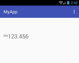
Hacer que RelativeSizeSpan se alinee hacia arriba
Para hacer que un RelativeSizeSpan alinee con la parte superior, se puede derivar una clase personalizada de la clase SuperscriptSpan . En el siguiente ejemplo, la clase derivada se llama TopAlignSuperscriptSpan :
activity_main.xml:
<TextView
    android:id="@+id/txtView"
    android:layout_width="wrap_content"
    android:layout_height="wrap_content"
    android:layout_marginTop="50dp"
    android:textSize="26sp" />
MainActivity.java:
TextView txtView = (TextView) findViewById(R.id.txtView);

SpannableString spannableString = new SpannableString("RM123.456");
spannableString.setSpan( new TopAlignSuperscriptSpan( (float)0.35 ), 0, 2, Spanned.SPAN_EXCLUSIVE_EXCLUSIVE );
txtView.setText(spannableString);
TopAlignSuperscriptSpan.java:
private class TopAlignSuperscriptSpan extends SuperscriptSpan {
    //divide superscript by this number
    protected int fontScale = 2;

    //shift value, 0 to 1.0
    protected float shiftPercentage = 0;

    //doesn't shift
    TopAlignSuperscriptSpan() {}

    //sets the shift percentage
    TopAlignSuperscriptSpan( float shiftPercentage ) {
        if( shiftPercentage > 0.0 && shiftPercentage < 1.0 )
            this.shiftPercentage = shiftPercentage;
    }

    @Override
    public void updateDrawState( TextPaint tp ) {
        //original ascent
        float ascent = tp.ascent();

        //scale down the font
        tp.setTextSize( tp.getTextSize() / fontScale );

        //get the new font ascent
        float newAscent = tp.getFontMetrics().ascent;

        //move baseline to top of old font, then move down size of new font
        //adjust for errors with shift percentage
        tp.baselineShift += ( ascent - ascent * shiftPercentage )
                - (newAscent - newAscent * shiftPercentage );
    }

    @Override
    public void updateMeasureState( TextPaint tp ) {
        updateDrawState( tp );
    }
}
Captura de pantalla de referencia:
Pinchzoom en TextView
activity_main.xml :
<?xml version="1.0" encoding="utf-8"?>
<RelativeLayout xmlns:android="http://schemas.android.com/apk/res/android"
    android:layout_width="fill_parent"
    android:layout_height="fill_parent"
    android:orientation="vertical" >

    <TextView
        android:id="@+id/mytv"
        android:layout_width="fill_parent"
        android:layout_height="wrap_content"
        android:layout_alignParentLeft="true"
        android:layout_alignParentTop="true"
        android:text="This is my sample text for pinch zoom demo, you can zoom in and out using pinch zoom, thanks" />

</RelativeLayout>
MainActivity.java :
import android.app.Activity;
import android.os.Bundle;
import android.view.MotionEvent;
import android.view.View;
import android.view.View.OnTouchListener;
import android.widget.TextView;

public class MyTextViewPinchZoomClass extends Activity implements OnTouchListener {

    final static float STEP = 200;
    TextView mytv;
    float mRatio = 1.0f;
    int mBaseDist;
    float mBaseRatio;
    float fontsize = 13;

    public void onCreate(Bundle savedInstanceState) {
        super.onCreate(savedInstanceState);
        setContentView(R.layout.activity_main);

        mytv = (TextView) findViewById(R.id.mytv);
        mytv.setTextSize(mRatio + 13);
    }

    public boolean onTouchEvent(MotionEvent event) {
        if (event.getPointerCount() == 2) {
            int action = event.getAction();
            int pureaction = action & MotionEvent.ACTION_MASK;
            if (pureaction == MotionEvent.ACTION_POINTER_DOWN) {
                mBaseDist = getDistance(event);
                mBaseRatio = mRatio;
            } else {
                float delta = (getDistance(event) - mBaseDist) / STEP;
                float multi = (float) Math.pow(2, delta);
                mRatio = Math.min(1024.0f, Math.max(0.1f, mBaseRatio * multi));
                mytv.setTextSize(mRatio + 13);
            }
        }
        return true;
    }

    int getDistance(MotionEvent event) {
        int dx = (int) (event.getX(0) - event.getX(1));
        int dy = (int) (event.getY(0) - event.getY(1));
        return (int) (Math.sqrt(dx * dx + dy * dy));
    }

    public boolean onTouch(View v, MotionEvent event) {
        return false;
    }
}
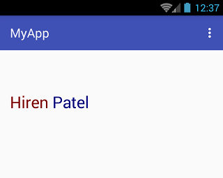
TextView único con dos colores diferentes
El texto coloreado se puede crear pasando el texto y un nombre de color de fuente a la siguiente función:
private String getColoredSpanned(String text, String color) {
    String input = "<font color=" + color + ">" + text + "</font>";
    return input;
}
El texto coloreado se puede configurar en TextView (o incluso en Button , EditText , etc.) usando el código de ejemplo a continuación.
Primero, define un TextView siguiente manera:
TextView txtView = (TextView)findViewById(R.id.txtView);
Luego, crea un texto de diferente color y asignalo a cadenas:
String name = getColoredSpanned("Hiren", "#800000");
String surName = getColoredSpanned("Patel","#000080");
Finalmente, establezca las dos cadenas de colores diferentes en TextView :
txtView.setText(Html.fromHtml(name+" "+surName));
Captura de pantalla de referencia: