Android
Affichage
Recherche…
Introduction
Tout ce qui concerne la personnalisation de TextView dans le SDK Android
Syntaxe
- TextView (contexte contextuel)
- (TextView) findViewById (int id)
- void setText (int resid)
- void setText (texte CharSequence) // Vous pouvez utiliser String comme argument
Remarques
Essayez de l'utiliser dans la conception XML ou par programme.
Textview avec une taille de texte différente
Vous pouvez archiver différents Textsizes dans une Textview avec un Span
TextView textView = (TextView) findViewById(R.id.textView);
Spannable span = new SpannableString(textView.getText());
span.setSpan(new RelativeSizeSpan(0.8f), start, end, Spannable.SPAN_EXCLUSIVE_EXCLUSIVE);
textView.setText(span)
Personnalisation de TextView
public class CustomTextView extends TextView {

    private float strokeWidth;
    private Integer strokeColor;
    private Paint.Join strokeJoin;
    private float strokeMiter;


    public CustomTextView(Context context) {
        super(context);
        init(null);
    }

    public CustomTextView(Context context, AttributeSet attrs) {
        super(context, attrs);
        init(attrs);
    }

    public CustomTextView(Context context, AttributeSet attrs, int defStyle) {
        super(context, attrs, defStyle);
        init(attrs);
    }

    public void init(AttributeSet attrs) {

        if (attrs != null) {
            TypedArray a = getContext().obtainStyledAttributes(attrs, R.styleable.CustomTextView);

            if (a.hasValue(R.styleable.CustomTextView_strokeColor)) {
                float strokeWidth = a.getDimensionPixelSize(R.styleable.CustomTextView_strokeWidth, 1);
                int strokeColor = a.getColor(R.styleable.CustomTextView_strokeColor, 0xff000000);
                float strokeMiter = a.getDimensionPixelSize(R.styleable.CustomTextView_strokeMiter, 10);
                Paint.Join strokeJoin = null;
                switch (a.getInt(R.styleable.CustomTextView_strokeJoinStyle, 0)) {
                    case (0):
                        strokeJoin = Paint.Join.MITER;
                        break;
                    case (1):
                        strokeJoin = Paint.Join.BEVEL;
                        break;
                    case (2):
                        strokeJoin = Paint.Join.ROUND;
                        break;
                }
                this.setStroke(strokeWidth, strokeColor, strokeJoin, strokeMiter);
            }
        }
    }

    public void setStroke(float width, int color, Paint.Join join, float miter) {
        strokeWidth = width;
        strokeColor = color;
        strokeJoin = join;
        strokeMiter = miter;
    }

    @Override
    public void onDraw(Canvas canvas) {
        super.onDraw(canvas);

        int restoreColor = this.getCurrentTextColor();
        if (strokeColor != null) {
            TextPaint paint = this.getPaint();
            paint.setStyle(Paint.Style.STROKE);
            paint.setStrokeJoin(strokeJoin);
            paint.setStrokeMiter(strokeMiter);
            this.setTextColor(strokeColor);
            paint.setStrokeWidth(strokeWidth);
            super.onDraw(canvas);
            paint.setStyle(Paint.Style.FILL);
            this.setTextColor(restoreColor);
        }
    }
}
Usage:
public class MainActivity extends Activity {

    @Override
    protected void onCreate(Bundle savedInstanceState) {
        super.onCreate(savedInstanceState);
        setContentView(R.layout.activity_main);

        CustomTextView customTextView = (CustomTextView) findViewById(R.id.pager_title);
    }
}
Disposition:
<RelativeLayout xmlns:android="http://schemas.android.com/apk/res/android"
    xmlns:app="http://schemas.android.com/apk/res-auto"
    android:layout_width="fill_parent"
    android:layout_height="fill_parent"
    android:background="@mipmap/background">


    <pk.sohail.gallerytest.activity.CustomTextView
        android:id="@+id/pager_title"
        android:layout_width="wrap_content"
        android:layout_height="wrap_content"
        android:layout_centerHorizontal="true"
        android:layout_centerVertical="true"
        android:gravity="center"
        android:text="@string/txt_title_photo_gallery"
        android:textColor="@color/white"
        android:textSize="30dp"
        android:textStyle="bold"
        app:outerShadowRadius="10dp"
        app:strokeColor="@color/title_text_color"
        app:strokeJoinStyle="miter"
        app:strokeWidth="2dp" />

</RelativeLayout>
attars:
<?xml version="1.0" encoding="utf-8"?>
<resources>

    <declare-styleable name="CustomTextView">

        <attr name="outerShadowRadius" format="dimension" />
        <attr name="strokeWidth" format="dimension" />
        <attr name="strokeMiter" format="dimension" />
        <attr name="strokeColor" format="color" />
        <attr name="strokeJoinStyle">
            <enum name="miter" value="0" />
            <enum name="bevel" value="1" />
            <enum name="round" value="2" />
        </attr>
    </declare-styleable>

</resources>
Utilisation par programme:
CustomTextView mtxt_name = (CustomTextView) findViewById(R.id.pager_title);
//then use
setStroke(float width, int color, Paint.Join join, float miter);
//method before setting
setText("Sample Text");
TextView Spannable
Un TextView pouvant être TextView peut être utilisé dans Android pour mettre en évidence une partie particulière du texte avec une couleur, un style, une taille et / ou un événement de clic différents dans un seul widget TextView .
Considérer que vous avez défini un TextView comme suit:
TextView textview=findViewById(R.id.textview);
Ensuite, vous pouvez appliquer différentes mises en évidence comme indiqué ci-dessous:
Couleur Spanable: pour définir une couleur différente sur une partie du texte, vous pouvez utiliser
ForegroundColorSpan, comme illustré dans l'exemple suivant:Spannable spannable = new SpannableString(firstWord+lastWord); spannable.setSpan(new ForegroundColorSpan(firstWordColor), 0, firstWord.length(), Spannable.SPAN_EXCLUSIVE_EXCLUSIVE); spannable.setSpan(new ForegroundColorSpan(lastWordColor), firstWord.length(), firstWord.length()+lastWord.length(), Spannable.SPAN_EXCLUSIVE_EXCLUSIVE); textview.setText( spannable );Sortie créée par le code ci-dessus:

Police Spanable: pour définir une taille de police différente sur une partie du texte, vous pouvez utiliser
RelativeSizeSpan, comme illustré dans l'exemple suivant:Spannable spannable = new SpannableString(firstWord+lastWord); spannable.setSpan(new RelativeSizeSpan(1.1f),0, firstWord.length(), Spannable.SPAN_EXCLUSIVE_EXCLUSIVE); // set size spannable.setSpan(new RelativeSizeSpan(0.8f), firstWord.length(), firstWord.length() + lastWord.length(), Spannable.SPAN_EXCLUSIVE_EXCLUSIVE); // set size textview.setText( spannable );Sortie créée par le code ci-dessus:

Police de caractères Spanable: pour définir une police de caractères différente sur une partie du texte, vous pouvez utiliser un
TypefaceSpanpersonnalisé, comme illustré dans l'exemple suivant:Spannable spannable = new SpannableString(firstWord+lastWord); spannable.setSpan( new CustomTypefaceSpan("SFUIText-Bold.otf",fontBold), 0, firstWord.length(), Spannable.SPAN_EXCLUSIVE_EXCLUSIVE); spannable.setSpan( new CustomTypefaceSpan("SFUIText-Regular.otf",fontRegular), firstWord.length(), firstWord.length() + lastWord.length(), Spannable.SPAN_EXCLUSIVE_EXCLUSIVE); text.setText( spannable );Cependant, pour que le code ci-dessus fonctionne, la classe
CustomTypefaceSpandoit être dérivée de la classeTypefaceSpan. Cela peut être fait comme suit:public class CustomTypefaceSpan extends TypefaceSpan { private final Typeface newType; public CustomTypefaceSpan(String family, Typeface type) { super(family); newType = type; } @Override public void updateDrawState(TextPaint ds) { applyCustomTypeFace(ds, newType); } @Override public void updateMeasureState(TextPaint paint) { applyCustomTypeFace(paint, newType); } private static void applyCustomTypeFace(Paint paint, Typeface tf) { int oldStyle; Typeface old = paint.getTypeface(); if (old == null) { oldStyle = 0; } else { oldStyle = old.getStyle(); } int fake = oldStyle & ~tf.getStyle(); if ((fake & Typeface.BOLD) != 0) { paint.setFakeBoldText(true); } if ((fake & Typeface.ITALIC) != 0) { paint.setTextSkewX(-0.25f); } paint.setTypeface(tf); } }
TextView avec image
Android permet aux programmeurs de placer des images aux quatre coins d'un TextView . Par exemple, si vous créez un champ avec un objet TextView et que vous souhaitez montrer que le champ est modifiable, les développeurs placent généralement une icône d'édition à proximité de ce champ. Android nous offre une option intéressante appelée composé extractible pour un TextView :
<TextView
        android:id="@+id/title"
        android:layout_width="wrap_content"
        android:layout_height="wrap_content"
        android:layout_centerInParent="true"
        android:drawablePadding="4dp"
        android:drawableRight="@drawable/edit"
        android:text="Hello world"
        android:textSize="18dp" />
Vous pouvez définir le dessin sur n'importe quel côté de votre TextView comme suit:
android:drawableLeft="@drawable/edit"
android:drawableRight="@drawable/edit"
android:drawableTop="@drawable/edit"
android:drawableBottom="@drawable/edit"
Le paramétrage du dessin peut également être réalisé par programmation de la manière suivante:
yourTextView.setCompoundDrawables(leftDrawable, rightDrawable, topDrawable, bottomDrawable);
La définition de l'un des paramètres remis à setCompoundDrawables() sur null supprimera l'icône du côté correspondant de TextView .
Texte barré
Barré le texte entier
String sampleText = "This is a test strike";
textView.setPaintFlags(tv.getPaintFlags()| Paint.STRIKE_THRU_TEXT_FLAG);
textView.setText(sampleText);
Output: Ceci est un test de frappe
Barré seulement des parties du texte
String sampleText = "This is a test strike";
SpannableStringBuilder spanBuilder = new SpannableStringBuilder(sampleText);
StrikethroughSpan strikethroughSpan = new StrikethroughSpan();
spanBuilder.setSpan(
        strikethroughSpan, // Span to add
        0, // Start
        4, // End of the span (exclusive)
        Spanned.SPAN_EXCLUSIVE_EXCLUSIVE // Text changes will not reflect in the strike changing
);
textView.setText(spanBuilder);
Output: Ceci est un test de frappe
Personnalisation du thème et du style
MainActivity.java:
public class MainActivity extends AppCompatActivity {

    @Override
    protected void onCreate(Bundle savedInstanceState) {
        super.onCreate(savedInstanceState);
        setContentView(R.layout.activity_main);
    }
}
activity_main.xml:
<?xml version="1.0" encoding="utf-8"?>
<LinearLayout xmlns:android="http://schemas.android.com/apk/res/android"
    xmlns:custom="http://schemas.android.com/apk/res-auto"
    xmlns:tools="http://schemas.android.com/tools"
    android:layout_width="match_parent"
    android:layout_height="match_parent"
    android:gravity="center"
    android:orientation="vertical"
    tools:context=".MainActivity">

    <com.customthemeattributedemo.customview.CustomTextView
        style="?mediumTextStyle"
        android:layout_width="wrap_content"
        android:layout_height="wrap_content"
        android:layout_margin="20dp"
        android:text="@string/message_hello"
        custom:font_family="@string/bold_font" />

    <com.customthemeattributedemo.customview.CustomTextView
        style="?largeTextStyle"
        android:layout_width="wrap_content"
        android:layout_height="wrap_content"
        android:layout_margin="20dp"
        android:text="@string/message_hello"
        custom:font_family="@string/bold_font" />
</LinearLayout>
CustomTextView.java:
public class CustomTextView extends TextView {

    private static final String TAG = "TextViewPlus";
    private Context mContext;

    public CustomTextView(Context context) {
        super(context);
        mContext = context;
    }

    public CustomTextView(Context context, AttributeSet attrs) {
        super(context, attrs);
        mContext = context;
        setCustomFont(context, attrs);
    }

    public CustomTextView(Context context, AttributeSet attrs, int defStyle) {
        super(context, attrs, defStyle);
        mContext = context;
        setCustomFont(context, attrs);
    }

    private void setCustomFont(Context ctx, AttributeSet attrs) {
        TypedArray customFontNameTypedArray = ctx.obtainStyledAttributes(attrs, R.styleable.CustomTextView);
        String customFont = customFontNameTypedArray.getString(R.styleable.CustomTextView_font_family);
        Typeface typeface = null;
        typeface = Typeface.createFromAsset(ctx.getAssets(), customFont);
        setTypeface(typeface);
        customFontNameTypedArray.recycle();
    }
}
attrs.xml:
<?xml version="1.0" encoding="utf-8"?>
<resources>

    <attr name="mediumTextStyle" format="reference" />
    <attr name="largeTextStyle" format="reference" />

    <declare-styleable name="CustomTextView">

        <attr name="font_family" format="string" />
        <!--- Your other attributes -->

    </declare-styleable>
</resources>
strings.xml:
<resources>
    <string name="app_name">Custom Style Theme Attribute Demo</string>
    <string name="message_hello">Hello Hiren!</string>

    <string name="bold_font">bold.ttf</string>
</resources>
styles.xml:
<resources>

    <!-- Base application theme. -->
    <style name="AppTheme" parent="Theme.AppCompat.Light.DarkActionBar">
        <!-- Customize your theme here. -->
        <item name="colorPrimary">@color/colorPrimary</item>
        <item name="colorPrimaryDark">@color/colorPrimaryDark</item>
        <item name="colorAccent">@color/colorAccent</item>

        <item name="mediumTextStyle">@style/textMedium</item>
        <item name="largeTextStyle">@style/textLarge</item>
    </style>


    <style name="textMedium" parent="textParentStyle">
        <item name="android:textAppearance">@android:style/TextAppearance.Medium</item>
    </style>

    <style name="textLarge" parent="textParentStyle">
        <item name="android:textAppearance">@android:style/TextAppearance.Large</item>
    </style>

    <style name="textParentStyle">
        <item name="android:textColor">@android:color/white</item>
        <item name="android:background">@color/colorPrimary</item>
        <item name="android:padding">5dp</item>
    </style>

</resources>
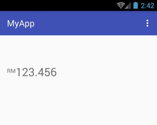
Rendre RelativeSizeSpan aligné sur le haut
Pour rendre un RelativeSizeSpan aligné sur le haut, une classe personnalisée peut être dérivée de la classe SuperscriptSpan . Dans l'exemple suivant, la classe dérivée est nommée TopAlignSuperscriptSpan :
activity_main.xml:
<TextView
    android:id="@+id/txtView"
    android:layout_width="wrap_content"
    android:layout_height="wrap_content"
    android:layout_marginTop="50dp"
    android:textSize="26sp" />
MainActivity.java:
TextView txtView = (TextView) findViewById(R.id.txtView);

SpannableString spannableString = new SpannableString("RM123.456");
spannableString.setSpan( new TopAlignSuperscriptSpan( (float)0.35 ), 0, 2, Spanned.SPAN_EXCLUSIVE_EXCLUSIVE );
txtView.setText(spannableString);
TopAlignSuperscriptSpan.java:
private class TopAlignSuperscriptSpan extends SuperscriptSpan {
    //divide superscript by this number
    protected int fontScale = 2;

    //shift value, 0 to 1.0
    protected float shiftPercentage = 0;

    //doesn't shift
    TopAlignSuperscriptSpan() {}

    //sets the shift percentage
    TopAlignSuperscriptSpan( float shiftPercentage ) {
        if( shiftPercentage > 0.0 && shiftPercentage < 1.0 )
            this.shiftPercentage = shiftPercentage;
    }

    @Override
    public void updateDrawState( TextPaint tp ) {
        //original ascent
        float ascent = tp.ascent();

        //scale down the font
        tp.setTextSize( tp.getTextSize() / fontScale );

        //get the new font ascent
        float newAscent = tp.getFontMetrics().ascent;

        //move baseline to top of old font, then move down size of new font
        //adjust for errors with shift percentage
        tp.baselineShift += ( ascent - ascent * shiftPercentage )
                - (newAscent - newAscent * shiftPercentage );
    }

    @Override
    public void updateMeasureState( TextPaint tp ) {
        updateDrawState( tp );
    }
}
Capture d'écran de référence:
Pinchzoom sur TextView
activity_main.xml :
<?xml version="1.0" encoding="utf-8"?>
<RelativeLayout xmlns:android="http://schemas.android.com/apk/res/android"
    android:layout_width="fill_parent"
    android:layout_height="fill_parent"
    android:orientation="vertical" >

    <TextView
        android:id="@+id/mytv"
        android:layout_width="fill_parent"
        android:layout_height="wrap_content"
        android:layout_alignParentLeft="true"
        android:layout_alignParentTop="true"
        android:text="This is my sample text for pinch zoom demo, you can zoom in and out using pinch zoom, thanks" />

</RelativeLayout>
MainActivity.java :
import android.app.Activity;
import android.os.Bundle;
import android.view.MotionEvent;
import android.view.View;
import android.view.View.OnTouchListener;
import android.widget.TextView;

public class MyTextViewPinchZoomClass extends Activity implements OnTouchListener {

    final static float STEP = 200;
    TextView mytv;
    float mRatio = 1.0f;
    int mBaseDist;
    float mBaseRatio;
    float fontsize = 13;

    public void onCreate(Bundle savedInstanceState) {
        super.onCreate(savedInstanceState);
        setContentView(R.layout.activity_main);

        mytv = (TextView) findViewById(R.id.mytv);
        mytv.setTextSize(mRatio + 13);
    }

    public boolean onTouchEvent(MotionEvent event) {
        if (event.getPointerCount() == 2) {
            int action = event.getAction();
            int pureaction = action & MotionEvent.ACTION_MASK;
            if (pureaction == MotionEvent.ACTION_POINTER_DOWN) {
                mBaseDist = getDistance(event);
                mBaseRatio = mRatio;
            } else {
                float delta = (getDistance(event) - mBaseDist) / STEP;
                float multi = (float) Math.pow(2, delta);
                mRatio = Math.min(1024.0f, Math.max(0.1f, mBaseRatio * multi));
                mytv.setTextSize(mRatio + 13);
            }
        }
        return true;
    }

    int getDistance(MotionEvent event) {
        int dx = (int) (event.getX(0) - event.getX(1));
        int dy = (int) (event.getY(0) - event.getY(1));
        return (int) (Math.sqrt(dx * dx + dy * dy));
    }

    public boolean onTouch(View v, MotionEvent event) {
        return false;
    }
}
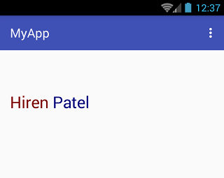
Single TextView avec deux couleurs différentes
Le texte coloré peut être créé en transmettant le texte et un nom de couleur de police à la fonction suivante:
private String getColoredSpanned(String text, String color) {
    String input = "<font color=" + color + ">" + text + "</font>";
    return input;
}
Le texte en couleur peut alors être défini sur un TextView (ou même sur un Button , EditText , etc.) en utilisant l'exemple de code ci-dessous.
Tout d'abord, définissez un TextView comme suit:
TextView txtView = (TextView)findViewById(R.id.txtView);
Ensuite, créez un texte de couleur différente et assignez-le aux chaînes:
String name = getColoredSpanned("Hiren", "#800000");
String surName = getColoredSpanned("Patel","#000080");
Enfin, définissez les deux chaînes de couleurs différentes sur le TextView :
txtView.setText(Html.fromHtml(name+" "+surName));
Capture d'écran de référence: