Android
TextInputLayout
サーチ…
前書き
TextInputLayoutは、EditTextに浮動ラベルを表示するために導入されました。フローティングラベルを表示するには、EditTextをTextInputLayoutでラップする必要があります。
備考
TextInputLayoutは、ユーザーがテキストを入力したためにヒントが非表示になっているときに、 EditText (または子孫)をラップしてフローティングラベルを表示するレイアウトです。 TextInputLayout EditTextすると、 EditText下にエラーメッセージを表示することができます。
依存関係の下でアプリケーションのbuild.gradleファイルに次の依存関係が追加されていることを確認してください。
compile 'com.android.support:design:25.3.1'
基本的な使用法
これはTextInputLayout基本的な使い方です。
備考の節で説明されているように、 build.gradleファイルに依存関係を追加してください。
例:
 <android.support.design.widget.TextInputLayout
         android:layout_width="match_parent"
         android:layout_height="wrap_content">

     <EditText
             android:layout_width="match_parent"
             android:layout_height="wrap_content"
             android:hint="@string/username"/>

 </android.support.design.widget.TextInputLayout>
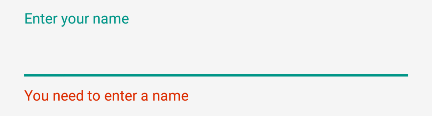
エラーの処理
あなたは使用することができますTextInputLayoutに従って、エラーメッセージを表示するには、 材料設計ガイドライン使っsetErrorとsetErrorEnabled方法を。
EditTextの下にエラーを表示するには:
TextInputLayout til = (TextInputLayout) findViewById(R.id.username);
til.setErrorEnabled(true);
til.setError("You need to enter a name");
TextInputLayoutエラーを有効にするには、xmlまたはtil.setErrorEnabled(true); app:errorEnabled="true"を使用できtil.setErrorEnabled(true);上記のように。
あなたは以下を得るでしょう:
文字カウントの追加
TextInputLayoutには、その中に定義されたEditTextの文字カウンターがあります。
カウンタはEditTextの下に表示されます。
setCounterEnabled()メソッドとsetCounterMaxLengthメソッドを使用してsetCounterEnabled() :
TextInputLayout til = (TextInputLayout) findViewById(R.id.username);
til.setCounterEnabled(true);
til.setCounterMaxLength(15);
またはapp:counterEnabledとapp:counterMaxLength 、XMLの属性。
<android.support.design.widget.TextInputLayout
    app:counterEnabled="true"
    app:counterMaxLength="15">

    <EditText/>

</android.support.design.widget.TextInputLayout>
パスワード表示の切り替え
入力パスワードタイプでは、 passwordToggleEnabled属性を使用してテキスト全体を表示または非表示にできるアイコンを有効にすることもできます。
次の属性を使用して同じデフォルトをカスタマイズすることもできます。
-
passwordToggleDrawable:デフォルトの目のアイコンを変更する -
passwordToggleTint:パスワード可視性トグル描画可能な色に色合いを適用します。 -
passwordToggleTintMode:背景色合いを適用するために使用されるブレンドモードを指定します。
例:
<android.support.design.widget.TextInputLayout
        android:layout_width="match_parent"
        android:layout_height="wrap_content"
        app:passwordToggleContentDescription="@string/description"
        app:passwordToggleDrawable="@drawable/another_toggle_drawable"
        app:passwordToggleEnabled="true">

            <EditText/>

</android.support.design.widget.TextInputLayout>
TextInputEditText
TextInputEditTextはEditTextであり、 「抽出」モードのときにIMEにヒントを表示するための追加の修正が加えられています 。
Extractモードは、スペースが小さすぎるときにEditTextをクリックしたときにキーボードエディタが切り替わるモードです(たとえば、スマートフォンのランドスケープ)。
この場合、テキストの編集中にEditTextを使用すると、IMEが編集中のもののヒントを与えることはありません
TextInputEditTextこの問題を修正し、ユーザーのデバイスのIMEが抽出モードになっている間にヒントテキストを提供します。
例:
<android.support.design.widget.TextInputLayout
    android:layout_width="match_parent"
    android:layout_height="wrap_content"
    android:hint="Description"
    >
    <android.support.design.widget.TextInputEditText
        android:id="@+id/description"
        android:layout_width="match_parent"
        android:layout_height="wrap_content"/>

</android.support.design.widget.TextInputLayout>
TextInputLayoutの外観のカスタマイズ
あなたはの外観をカスタマイズすることができTextInputLayoutとその組み込みEditTextあなたにカスタムスタイルを定義することでstyles.xml 。定義されたスタイルは、スタイルまたはテーマとしてTextInputLayout追加できます。
ヒントの外観をカスタマイズする例:
styles.xml :
<!--Floating label text style-->
<style name="MyHintStyle" parent="TextAppearance.AppCompat.Small">
    <item name="android:textColor">@color/black</item>
</style>

<!--Input field style-->
<style name="MyEditText" parent="Theme.AppCompat.Light">
    <item name="colorControlNormal">@color/indigo</item>
    <item name="colorControlActivated">@color/pink</item>
</style>
スタイルを適用するにはTextInputLayoutとEditTextを次のように更新します
<android.support.design.widget.TextInputLayout
    android:layout_width="match_parent"
    android:layout_height="wrap_content"
    app:hintTextAppearance="@style/MyHintStyle">

    <EditText
        android:layout_width="match_parent"
        android:layout_height="wrap_content"
        android:hint="@string/Title"
        android:theme="@style/MyEditText" />

</android.support.design.widget.TextInputLayout>
TextInputLayoutアクセントカラーをカスタマイズする例アクセントの色は、 EditTextのベースラインの色と浮動ヒントテキストのテキストの色に影響します。
styles.xml :
<style name="TextInputLayoutWithPrimaryColor" parent="Widget.Design.TextInputLayout">
    <item name="colorAccent">@color/primary</item>
</style>
レイアウトファイル:
<android.support.design.widget.TextInputLayout
            android:id="@+id/textInputLayout_password"
            android:layout_width="match_parent"
            android:layout_height="wrap_content"
            android:theme="@style/TextInputLayoutWithPrimaryColor">

            <android.support.design.widget.TextInputEditText
                android:id="@+id/textInputEditText_password"
                android:layout_width="match_parent"
                android:layout_height="wrap_content"
                android:hint="@string/login_hint_password"
                android:inputType="textPassword" />

</android.support.design.widget.TextInputLayout>