javafx
레이아웃
수색…
StackPane
StackPane 의 자식을 back-to-front 스택에 배치합니다.
아이의 Z 순서는, 아이리스트 ( getChildren 호출에 의해 액세스 할 수있는)의 순서로 정의됩니다. 제 0의 아이는 스택의 맨 아래, 마지막 아이는 스택의 맨 위에 있습니다.
스택 팬은 각 자식의 크기를 조정하여 자체 내용 영역을 채 웁니다. 아이를 사이즈 변경 할 수 없기 때문에 (사이즈 변경이 불가능하거나 최대 사이즈로 할 수 없기 때문에) StackPane 의 area를 전부 칠할 수없는 경우는, StackPane 페인의 alignmentProperty 디폴트는 Pos.CENTER. 사용해 영역 내에 배치됩니다 Pos.CENTER.
예
// Create a StackPane
StackPane pane = new StackPane();

// Create three squares
Rectangle rectBottom = new Rectangle(250, 250);
rectBottom.setFill(Color.AQUA);
Rectangle rectMiddle = new Rectangle(200, 200);
rectMiddle.setFill(Color.CADETBLUE);
Rectangle rectUpper = new Rectangle(150, 150);
rectUpper.setFill(Color.CORAL);

// Place them on top of each other
pane.getChildren().addAll(rectBottom, rectMiddle, rectUpper);

HBox 및 VBox
HBox 와 VBox 레이아웃은 매우 비슷하며 둘 다 한 줄로 자녀를 배치합니다.
공통 특성
HBox 또는 VBox 에 테두리 및 / 또는 패딩 세트가 있으면 해당 내용이 해당 인세 트 내에 HBox 됩니다.
아동의 가시적 인 재산 가치에 관계없이 각 관리 된 아동을 배치합니다. 관리되지 않는 자식은 무시됩니다.
내용의 정렬은 alignment 속성에 의해 제어되며, 기본값은 Pos.TOP_LEFT 입니다.
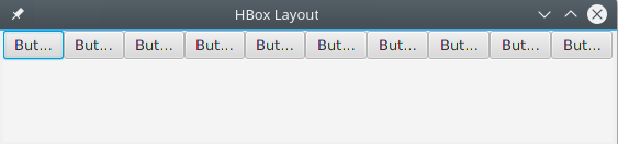
HBox
HBox 는 자식을 왼쪽에서 오른쪽으로 가로로 한 행에 배치합니다.
HBox 는 자식 (크기 재조정 할 수있는 경우) 을 원하는 너비 s로 크기 조정하고 fillHeight 속성을 사용하여 높이를 조정하여 높이를 채울지 또는 높이를 원하는대로 유지할지 결정합니다 (fillHeight 기본값은 true).
HBox 만들기
// HBox example
HBox row = new HBox();
Label first = new Label("First");
Label second = new Label("Second");
row.getChildren().addAll(first, second);
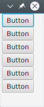
VBox
VBox 는 위에서 아래로 하나의 수직 열에 자식을 배치합니다.
VBox 는 자식의 크기 를 원하는 높이 로 조절하고 fillWidth 속성을 사용하여 너비를 조정하여 너비를 채우거나 너비를 원하는대로 유지할지 결정합니다 (fillWidth의 기본값은 true).
VBox 만들기
// VBox example
VBox column = new VBox();
Label upper = new Label("Upper");
Label lower = new Label("Lower");
column.getChildren().addAll(upper, lower);
BorderPane
BorderPane 는 5 개의 다른 영역으로 구분됩니다.
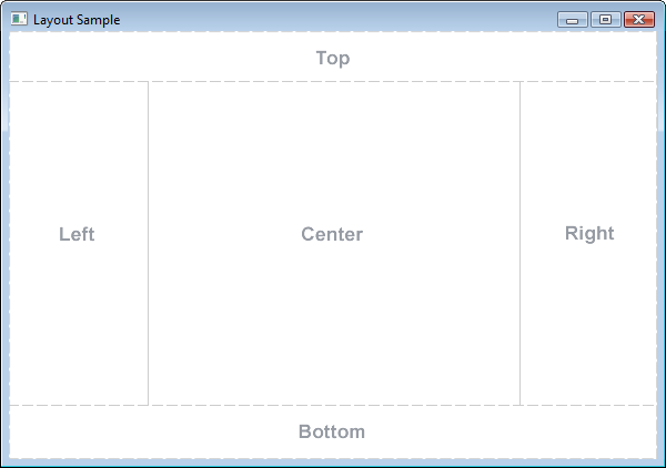
테두리 영역 ( Top , Right , Bottom , Left )은 내용에 따라 크기가 지정됩니다. 기본적으로 그들은 필요한 것만 취할 수있는 반면, Center 영역은 나머지 공간을 차지합니다. 경계 영역이 비어 있으면 공간을 차지하지 않습니다.
각 영역에는 하나의 요소 만 포함될 수 있습니다. 이 메소드는 setTop(Node) , setRight(Node) , setBottom(Node) , setLeft(Node) , setCenter(Node) 메소드를 사용하여 추가 할 수 있습니다. 다른 레이아웃을 사용하여 둘 이상의 요소를 단일 영역에 배치 할 수 있습니다.
//BorderPane example
BorderPane pane = new BorderPane();

Label top = new Label("Top");

Label right = new Label("Right");

HBox bottom = new HBox();
bottom.getChildren().addAll(new Label("First"), new Label("Second"));

VBox left = new VBox();
left.getChildren().addAll(new Label("Upper"), new Label("Lower"));

StackPane center = new StackPane();
center.getChildren().addAll(new Label("Lorem"), new Label("ipsum"));

pane.setTop(top);        //The text "Top"
pane.setRight(right);    //The text "Right"
pane.setBottom(bottom);  //Row of two texts
pane.setLeft(left);      //Column of two texts
pane.setCenter(center);  //Two texts on each other
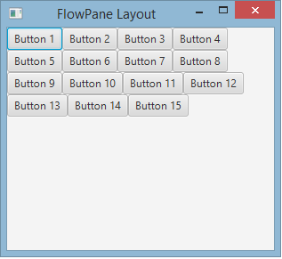
FlowPane
FlowPane 은 이용 가능한 수평 또는 수직 공간을 기반으로 행이나 열의 노드를 배치합니다. 수평 공간이 모든 노드의 너비의 합계보다 작 으면 노드는 다음 줄로 래핑됩니다. 수직 공간이 모든 노드의 높이의 합계보다 작 으면 노드를 다음 열로 래핑합니다. 다음 예제는 기본 가로 레이아웃을 보여줍니다.
import javafx.application.Application;
import javafx.fxml.FXMLLoader;
import javafx.scene.Parent;
import javafx.scene.Scene;
import javafx.scene.control.Button;
import javafx.scene.layout.FlowPane;
import javafx.stage.Stage;

public class Main extends Application {
    @Override
    public void start(Stage primaryStage) throws Exception{
        FlowPane root = new FlowPane();
        for (int i=1; i<=15; i++) {
            Button b1=new Button("Button "+String.valueOf(i));
            root.getChildren().add(b1); //for adding button to root
        }
        Scene scene = new Scene(root, 300, 250);
        primaryStage.setTitle("FlowPane Layout");
        primaryStage.setScene(scene);
        primaryStage.show();
    }
    public static void main(String[] args) {
        launch(args);
    }
}
기본
FlowPane생성자 :
FlowPane root = new FlowPane();
추가
FlowPane생성자 :
FlowPane() //Creates a horizontal FlowPane layout with hgap/vgap = 0 by default.
FlowPane(double hgap, double gap) //Creates a horizontal FlowPane layout with the specified hgap/vgap.
FlowPane(double hgap, double vgap, Node... children) //Creates a horizontal FlowPane layout with the specified hgap/vgap.
FlowPane(Node... children) //Creates a horizontal FlowPane layout with hgap/vgap = 0.
FlowPane(Orientation orientation) //Creates a FlowPane layout with the specified orientation and hgap/vgap = 0.
FlowPane(Orientation orientation, double hgap, double gap) //Creates a FlowPane layout with the specified orientation and hgap/vgap.
FlowPane(Orientation orientation, double hgap, double vgap, Node... children) //Creates a FlowPane layout with the specified orientation and hgap/vgap.
FlowPane(Orientation orientation, Node... children) //Creates a FlowPane layout with the specified orientation and hgap/vgap = 0.
레이아웃에 노드를 추가하면 부모
Paneadd()또는addAll()메서드가 사용됩니다.
Button btn = new Button("Demo Button");
root.getChildren().add(btn);
root.getChildren().addAll(…);
기본적으로 FlowPane 자식 노드를 왼쪽에서 오른쪽으로 배치합니다. 흐름 정렬을 변경하려면 Pos 유형의 열거 형 값을 전달하여 setAlignment() 메서드를 호출합니다.
일반적으로 사용되는 유동 정렬 :
root.setAlignment(Pos.TOP_RIGHT);     //for top right
root.setAlignment(Pos.TOP_CENTER);    //for top Center
root.setAlignment(Pos.CENTER);        //for Center
root.setAlignment(Pos.BOTTOM_RIGHT);  //for bottom right
GridPane
GridPane 는 그 자식을, 유연한 행과 열의 그리드 내에 배치합니다.
GridPane의 아이
아이는 GridPane 의 GridPane 장소에 배치 할 수있어 복수의 행이나 열 (디폴트의 스팬은 1)에 걸칠 가능성이있어 그리드 내의 배치는 레이아웃 제약에 의해 정의됩니다.
| 강제 | 기술 |
|---|---|
| columnIndex | 자녀의 레이아웃 영역이 시작되는 열. |
| rowIndex | 아이의 레이아웃 영역이 시작되는 행. |
| columnSpan | 아이의 레이아웃 영역이 수평에 걸치는 렬수. |
| rowSpan | 아이의 레이아웃 영역이 수직 방향에 걸치는 행의 수. |
그리드 패널이 컨텐츠를 수용하기 위해 그리드를 자동으로 확장 / 축소하기 때문에 전체 행 / 열 수를 미리 지정할 필요가 없습니다.
GridPane에 아이를 추가한다
새로운 추가하려면 Node A를들 GridPane 아이들의 레이아웃 제약의 정적 인 방법을 사용하여 설정해야합니다 GridPane 클래스를 한 후 그 아이들은에 추가 할 수 있습니다 GridPane 인스턴스입니다.
GridPane gridPane = new GridPane();

// Set the constraints: first row and first column
Label label = new Label("Example");
GridPane.setRowIndex(label, 0);
GridPane.setColumnIndex(label, 0);
// Add the child to the grid
gridpane.getChildren().add(label);
GridPane 는 다음 단계들을 결합하기위한 편리한 방법을 제공합니다 :
gridPane.add(new Button("Press me!"), 1, 0); // column=1 row=0
GridPane 클래스는 또한 자식 요소의 행 및 열 간격 을 설정하는 정적 setter 메서드를 제공합니다.
Label labelLong = new Label("Its a long text that should span several rows");
GridPane.setColumnSpan(labelLong, 2);
gridPane.add(labelLong, 0, 1);  // column=0 row=1
열과 행의 크기
기본적으로 행과 열의 크기는 콘텐츠에 맞게 조정됩니다. 행과 열 크기를 명시 적으로 제어 해야하는 경우 RowConstraints 및 ColumnConstraints 인스턴스를 GridPane 추가 할 수 있습니다. 이 두 제약 조건을 추가하면 첫 번째 열이 100 픽셀이고 두 번째 열이 200 픽셀 길이가되도록 위의 예제 크기가 조정됩니다.
gridPane.getColumnConstraints().add(new ColumnConstraints(100));
gridPane.getColumnConstraints().add(new ColumnConstraints(200));
디폴트에서는, GridPane 사이즈가 바람직한 사이즈보다 큰 경우에도, GridPane 는 행 / 열의 크기를 바람직한 사이즈로 변경합니다. 동적 열 / 행 크기 를 지원하기 위해 두 contstaints 클래스는 min size, max size 및 preferred size라는 세 가지 속성을 제공합니다.
또한 ColumnConstraints 는 setHGrow 제공하고 RowConstraints 는 성장 및 축소의 우선 순위에 영향 을 주는 setVGrow 메소드를 제공합니다. 세 가지 미리 정의 된 우선 순위는 다음과 같습니다.
- 평상시 . 항상 : 늘리거나 줄이기 위해 항상 늘리거나 줄이는 다른 레이아웃 영역과 함께 공간의 증가 또는 감소를 공유하십시오.
- 우선 순위 . 중간 단계 : 늘리거나 축소 한 다른 레이아웃 영역이 항상 존재하지 않거나 레이아웃 영역이 증가되거나 감소 된 공간을 모두 흡수하지 못하면 공간의 증가 또는 감소를 공유합니다. 다른 레이아웃 영역은 가끔 있습니다.
- Priority.NEVER : 영역에서 사용할 수있는 공간이 증가하거나 감소 할 경우 레이아웃 영역이 절대로 커지지 않습니다.
ColumnConstraints column1 = new ColumnConstraints(100, 100, 300);
column1.setHgrow(Priority.ALWAYS);
위에 정의 된 열은 최소 크기가 100 픽셀이며 최대 300 픽셀 너비에 도달 할 때까지 항상 커질 것입니다.
또한 행과 열의 크기 조정 비율 을 정의 할 수도 있습니다. 다음의 예에서는, 최초의 열이 격자 팬의 폭의 40 %를 차지하고, 두 번째 열이 60 %를 채우는 GridPane 정의합니다.
GridPane gridpane = new GridPane();
ColumnConstraints column1 = new ColumnConstraints();
column1.setPercentWidth(40);
ColumnConstraints column2 = new ColumnConstraints();
column2.setPercentWidth(60);
gridpane.getColumnConstraints().addAll(column1, column2);
격자 셀 내부의 요소 정렬
배향의 Node (S)는 사용에 의해 정의 될 수 setHalignment (가로)의 방법 ColumnConstraints 클래스 setValignment (세로)의 방법 RowConstraints 클래스.
ColumnConstraints column1 = new ColumnConstraints();
column1.setHalignment(HPos.RIGHT);

RowConstraints row1 = new RowConstraints();
row1.setValignment(VPos.CENTER);
TilePane
타일 창 레이아웃은 FlowPane 레이아웃과 유사합니다. TilePane는 각 셀 또는 타일이 같은 크기 인 격자에 모든 노드를 배치합니다. 그것은 수평 또는 수직으로 깔끔한 행과 열의 노드를 정렬합니다.
    import javafx.application.Application;
    import javafx.scene.Scene;
    import javafx.scene.control.Button;
    import javafx.scene.layout.TilePane;
    import javafx.stage.Stage;

    public class Main extends Application {

        @Override
        public void start(Stage primaryStage) {
            primaryStage.setTitle("TilePane Demo");
            double width = 400;
            double height = 300;
            TilePane root = new TilePane();
            root.setStyle("-fx-background-color:blue");
            // to set horizontal and vertical gap
            root.setHgap(20);
            root.setVgap(50);
            Button bl = new Button("Buttons");
            root.getChildren().add(bl);
            Button btn = new Button("Button");
            root.getChildren().add(btn);
            Button btn1 = new Button("Button 1");
            root.getChildren().add(btn1);
            Button btn2 = new Button("Button 2");
            root.getChildren().add(btn2);
            Button btn3 = new Button("Button 3");
            root.getChildren().add(btn3);
            Button btn4 = new Button("Button 4");
            root.getChildren().add(btn4);

            Scene scene = new Scene(root, width, height);
            primaryStage.setScene(scene);
            primaryStage.show();
        }


        public static void main(String[] args) {
            launch(args);
        }
    }
산출
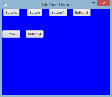
타일 창을 만들려면
TilePane root = new TilePane();
setHgap () 그리고 setVgap () 메서드는 열과 열 사이에 간격을 만드는 데 사용됩니다. 우리는 또한 레이아웃을 사용하여
int columnCount = 2;
root.setPrefColumns(columnCount);
앵커 판
AnchorPane a는 내용을 특정면과의 거리에 배치 할 수있는 레이아웃입니다.
AnchorPane 에는 4 가지 설정 방법과 4 가지 방법이 있습니다. 이러한 메소드의 첫 번째 매개 변수는 자식 Node 입니다. setter의 두 번째 매개 변수는 사용할 Double 값입니다. 이 값은 주어진면에 대한 제한 조건이 없음을 나타내는 null 수 있습니다.
| 세터 방법 | 게터 방법 |
|---|---|
| setBottomAnchor | getBottomAnchor |
| setLeftAnchor | getLeftAnchor |
| setRightAnchor | getRightAnchor |
| setTopAnchor | getTopAnchor |
다음 예제에서는 측면에서 지정된 거리에 노드를 배치합니다.
center 영역은 측면에서 지정된 거리를 유지하도록 크기가 조정됩니다. 창 크기를 조정할 때의 동작을 관찰하십시오.
public static void setBackgroundColor(Region region, Color color) {
    // change to 50% opacity
    color = color.deriveColor(0, 1, 1, 0.5);
    region.setBackground(new Background(new BackgroundFill(color, CornerRadii.EMPTY, Insets.EMPTY)));
}

@Override
public void start(Stage primaryStage) {
    Region right = new Region();
    Region top = new Region();
    Region left = new Region();
    Region bottom = new Region();
    Region center = new Region();

    right.setPrefSize(50, 150);
    top.setPrefSize(150, 50);
    left.setPrefSize(50, 150);
    bottom.setPrefSize(150, 50);

    // fill with different half-transparent colors
    setBackgroundColor(right, Color.RED);
    setBackgroundColor(left, Color.LIME);
    setBackgroundColor(top, Color.BLUE);
    setBackgroundColor(bottom, Color.YELLOW);
    setBackgroundColor(center, Color.BLACK);

    // set distances to sides
    AnchorPane.setBottomAnchor(bottom, 50d);
    AnchorPane.setTopAnchor(top, 50d);
    AnchorPane.setLeftAnchor(left, 50d);
    AnchorPane.setRightAnchor(right, 50d);

    AnchorPane.setBottomAnchor(center, 50d);
    AnchorPane.setTopAnchor(center, 50d);
    AnchorPane.setLeftAnchor(center, 50d);
    AnchorPane.setRightAnchor(center, 50d);

    // create AnchorPane with specified children
    AnchorPane anchorPane = new AnchorPane(left, top, right, bottom, center);

    Scene scene = new Scene(anchorPane, 200, 200);

    primaryStage.setScene(scene);
    primaryStage.show();
}