수색…
통사론
- clear : none | 왼쪽 | 오른쪽 | 둘 다 | 인라인 스타트 | 인라인 - 엔드;
- float : 왼쪽 | 오른쪽 | 없음 | 인라인 스타트 | 인라인 - 엔드;
비고
float은 블록 레이아웃의 사용을 암시하기 때문에 어떤 경우에는 표시 값의 계산 된 값을 수정합니다 [1]
[1] : https://developer.mozilla.org/en-US/docs/Web/CSS/float MDN
텍스트 내에서 이미지 띄우기
float의 가장 기본적인 사용은 이미지 주위에 텍스트 줄 바꿈을하는 것입니다. 아래 코드는 두 단락과 이미지를 생성하고 두 번째 단락은 이미지 주위로 흐르게합니다. float 요소 주위를 흐르는 float 요소 뒤에 항상 내용이 있음에 유의하십시오.
HTML :
<p>Lorem ipsum dolor sit amet, consectetur adipiscing elit. Integer nec odio. Praesent libero. Sed cursus ante dapibus diam. Sed nisi. Nulla quis sem at nibh elementum imperdiet. Duis sagittis ipsum. Praesent mauris. Fusce nec tellus sed augue semper porta. Mauris massa. Vestibulum lacinia arcu eget nulla. </p>

<img src="http://lorempixel.com/200/100/" />

<p>Class aptent taciti sociosqu ad litora torquent per conubia nostra, per inceptos himenaeos. Curabitur sodales ligula in libero. Sed dignissim lacinia nunc. Curabitur tortor. Pellentesque nibh. Aenean quam. In scelerisque sem at dolor. Maecenas mattis. Sed convallis tristique sem. Proin ut ligula vel nunc egestas porttitor. Morbi lectus risus, iaculis vel, suscipit quis, luctus non, massa. Fusce ac turpis quis ligula lacinia aliquet. </p>
CSS :
img {
  float:left;
  margin-right:1rem;
}
이것은 출력이 될 것입니다. 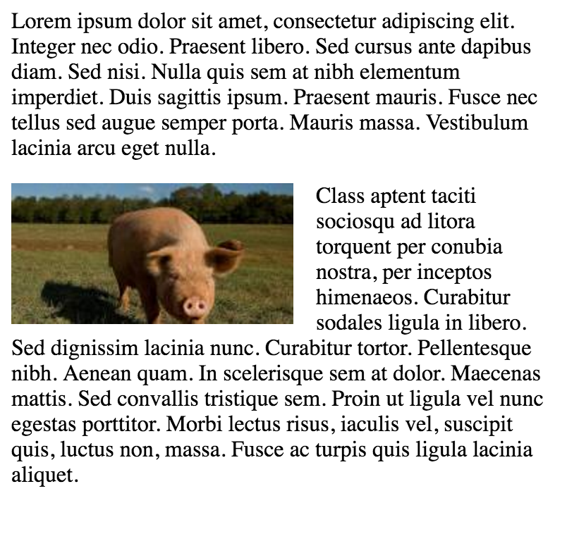
간단한 두 가지 고정 너비 열 레이아웃
간단한 2 열 레이아웃은 두 개의 고정 너비 부동 요소로 구성됩니다. 이 예제에서는 세로 막대와 내용 영역의 높이가 같지 않습니다. 이것은 부동 소수점을 사용하는 다중 열 레이아웃의 까다로운 부분 중 하나이며 여러 열을 같은 높이로 표시하는 해결 방법이 필요합니다.
HTML :
<div class="wrapper">

<div class="sidebar">
  <h2>Sidebar</h2>

  <p>Lorem ipsum dolor sit amet, consectetur adipiscing elit. Integer nec odio.</p>
</div>

<div class="content">
  <h1>Content</h1>

  <p>Class aptent taciti sociosqu ad litora torquent per conubia nostra, per inceptos himenaeos. Curabitur sodales ligula in libero. Sed dignissim lacinia nunc. Curabitur tortor. Pellentesque nibh. Aenean quam. In scelerisque sem at dolor. Maecenas mattis. Sed convallis tristique sem. Proin ut ligula vel nunc egestas porttitor. Morbi lectus risus, iaculis vel, suscipit quis, luctus non, massa. Fusce ac turpis quis ligula lacinia aliquet. </p>
</div>

</div>
CSS :
.wrapper {
  width:600px;
  padding:20px;
  background-color:pink;

  /* Floated elements don't use any height. Adding "overflow:hidden;" forces the
     parent element to expand to contain its floated children. */
  overflow:hidden;
}

.sidebar {
  width:150px;
  float:left;
  background-color:blue;
}

.content {
  width:450px;
  float:right;
  background-color:yellow;
}
간단한 세 가지 고정 너비 열 레이아웃
HTML :
<div class="wrapper">
  <div class="left-sidebar">
    <h1>Left Sidebar</h1>
    <p>Lorem ipsum dolor sit amet, consectetur adipiscing elit. </p>
  </div>
  <div class="content">
    <h1>Content</h1>
    <p>Class aptent taciti sociosqu ad litora torquent per conubia nostra, per inceptos himenaeos. Curabitur sodales ligula in libero. Sed dignissim lacinia nunc. Curabitur tortor. Pellentesque nibh. Aenean quam. In scelerisque sem at dolor. Maecenas mattis. Sed convallis tristique sem. Proin ut ligula vel nunc egestas porttitor. Morbi lectus risus, iaculis vel, suscipit quis, luctus non, massa. </p>
  </div>
  <div class="right-sidebar">
    <h1>Right Sidebar</h1>
    <p>Fusce ac turpis quis ligula lacinia aliquet.</p>
  </div>
</div>
CSS :
.wrapper {
  width:600px;
  background-color:pink;
  padding:20px;

  /* Floated elements don't use any height. Adding "overflow:hidden;" forces the
     parent element to expand to contain its floated children. */
  overflow:hidden;
}

.left-sidebar {
  width:150px;
  background-color:blue;
  float:left;
}

.content {
  width:300px;
  background-color:yellow;
  float:left;
}

.right-sidebar {
  width:150px;
  background-color:green;
  float:right;
}
2 열 게으른 / 욕심 많은 레이아웃
이 레이아웃은 하나의 플로팅 된 열을 사용하여 정의 된 너비가없는 2 열 레이아웃을 만듭니다. 이 예제에서 왼쪽 사이드 바는 필요한만큼의 공간 만 차지한다는 점에서 "게으른"것입니다. 이것을 말하기위한 또 다른 방법은 왼쪽 사이드 바가 "shrink-wrapped"라는 것입니다. 올바른 내용 열은 "욕심이 많다"는 점에서 나머지 공간을 모두 차지합니다.
HTML :
<div class="sidebar">
<h1>Sidebar</h1>
<img src="http://lorempixel.com/150/200/" />
</div>

<div class="content">
<h1>Content</h1>
<p>Lorem ipsum dolor sit amet, consectetur adipiscing elit. Integer nec odio. Praesent libero. Sed cursus ante dapibus diam. Sed nisi. Nulla quis sem at nibh elementum imperdiet. Duis sagittis ipsum. Praesent mauris. Fusce nec tellus sed augue semper porta. Mauris massa. Vestibulum lacinia arcu eget nulla. </p>
<p>Class aptent taciti sociosqu ad litora torquent per conubia nostra, per inceptos himenaeos. Curabitur sodales ligula in libero. Sed dignissim lacinia nunc. Curabitur tortor. Pellentesque nibh. Aenean quam. In scelerisque sem at dolor. Maecenas mattis. Sed convallis tristique sem. Proin ut ligula vel nunc egestas porttitor. Morbi lectus risus, iaculis vel, suscipit quis, luctus non, massa. Fusce ac turpis quis ligula lacinia aliquet. Mauris ipsum. Nulla metus metus, ullamcorper vel, tincidunt sed, euismod in, nibh. </p>
</div>
CSS :
.sidebar {
  /* `display:table;` shrink-wraps the column */
  display:table;
  float:left;
  background-color:blue;
}

.content {
  /* `overflow:hidden;` prevents `.content` from flowing under `.sidebar` */
  overflow:hidden;
  background-color:yellow;
}
명확한 속성
명확한 속성은 수레와 직접적으로 관련이 있습니다. 속성 값 :
- none - 기본값. 양쪽에 떠 다니는 요소를 허용합니다.
- 왼쪽 - 왼쪽에 부동 요소가 허용되지 않음
- right - 오른쪽에 부동 요소가 허용되지 않습니다.
- 둘 다 - 왼쪽 또는 오른쪽에 부동 요소가 허용되지 않습니다.
- initial -이 속성을 기본값으로 설정합니다. 처음에 대해 읽어보십시오.
- inherit -이 속성을 부모 요소에서 상속받습니다. 상속에 대해 읽어보십시오.
<html>
<head>
<style>
img {
    float: left;
}

p.clear {
    clear: both;
}
</style>
</head>
<body>

<img src="https://static.pexels.com/photos/69372/pexels-photo-69372-medium.jpeg" width="100">
<p>Lorem ipsoum Lorem ipsoum Lorem ipsoum Lorem ipsoum Lorem ipsoum Lorem ipsoum Lorem ipsoum Lorem ipsoum Lorem ipsoum Lorem ipsoum Lorem ipsoum Lorem ipsoum </p>
<p class="clear">Lorem ipsoum Lorem ipsoum Lorem ipsoum Lorem ipsoum Lorem ipsoum Lorem ipsoum Lorem ipsoum Lorem ipsoum Lorem ipsoum Lorem ipsoum Lorem ipsoum Lorem ipsoum </p>

</body>
</html>
클리어 픽스
clearfix 해킹은 수레를 담는 대중적인 방법입니다 (N. Gallagher aka @necolas)
clear 속성과 혼동하지 않기 위해, clearfix는 개념 (즉, 수레와 관련이 있기 때문에 혼동 될 수 있음)입니다. float 를 포함 하려면 컨테이너 ( 부모 )에 .cf 또는 .clearfix 클래스를 추가하고 아래에 설명 된 몇 가지 규칙으로이 클래스의 스타일을 지정해야합니다.
약간 다른 효과 3 개 버전 (출처 : 새로운 마이크로 clearfix 해킹 N. 갤러거 및 의하여 다시로드 clearfix TJ Koblentz 의해)
Clearfix (포함 된 수레의 위쪽 여백 붕괴가 여전히 발생 함)
.cf:after {
    content: "";
    display: table;
}

.cf:after {
    clear: both;
}
포함 된 수레의 위쪽 여백 붕괴를 방지하는 Clearfix
/**
 * For modern browsers
 * 1. The space content is one way to avoid an Opera bug when the
 *    contenteditable attribute is included anywhere else in the document.
 *    Otherwise it causes space to appear at the top and bottom of elements
 *    that are clearfixed.
 * 2. The use of `table` rather than `block` is only necessary if using
 *    `:before` to contain the top-margins of child elements.
 */
.cf:before,
.cf:after {
    content: " "; /* 1 */
    display: table; /* 2 */
}

.cf:after {
    clear: both;
}
구식 브라우저 IE6 및 IE7 지원을 통한 Clearfix
.cf:before,
.cf:after {
    content: " ";
    display: table;
}

.cf:after {
    clear: both;
}

/**
 * For IE 6/7 only
 * Include this rule to trigger hasLayout and contain floats.
 */
.cf {
    *zoom: 1;
}
기타 리소스 : clearfix에 대해 알고있는 모든 내용이 잘못되었습니다 (clearfix 및 BFC - 블록 서식 지정 컨텍스트, hasLayout은 구식 브라우저 IE6에 관한 것일 수 있습니다. 7)
플로트를 사용하는 인라인 DIV
div 는 블럭 레벨 요소입니다. 즉, 페이지 너비 전체를 차지하고 형제는 너비와 관계없이 한쪽 아래에 배치됩니다.
<div>
    <p>This is DIV 1</p>
</div>
<div>
    <p>This is DIV 2</p>
</div>
다음 코드의 출력은 다음과 같습니다. 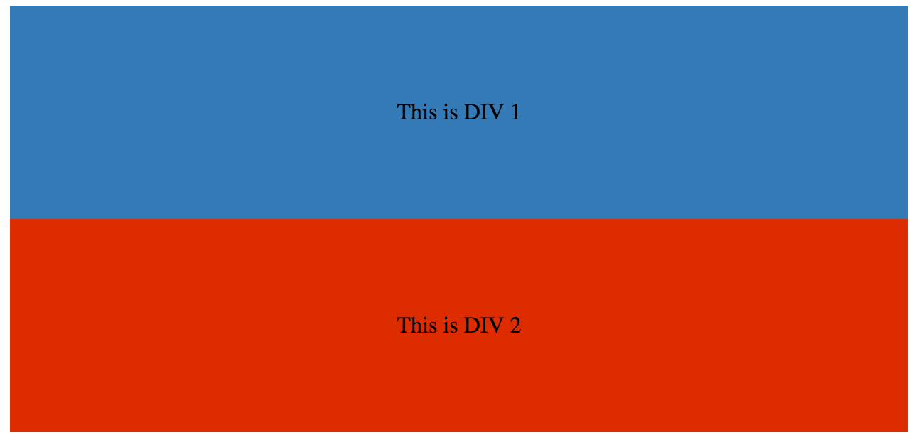
div float css 속성을 추가하여 인라인으로 만들 수 있습니다.
HTML :
<div class="outer-div">
    <div class="inner-div1">
        <p>This is DIV 1</p>
    </div>
    <div class="inner-div2">
        <p>This is DIV 2</p>
    </div>
</div>
CSS
.inner-div1 {
    width: 50%;
    margin-right:0px;
    float:left;
    background : #337ab7;
    padding:50px 0px;
}

.inner-div2 {
    width: 50%;
    margin-right:0px;
    float:left;
    background : #dd2c00;
    padding:50px 0px;
}

p {
    text-align:center;
}

오버 플로우 속성을 사용하여 실수 표시 제거
overflow 값을 hidden , auto 또는 요소로 scroll 하도록 설정하면 해당 요소 내의 모든 플로트가 지워집니다.
참고 : overflow:scroll 사용 overflow:scroll 은 항상 overflow:scroll 를 표시합니다.