खोज…
वाक्य - विन्यास
- स्पष्ट: कोई नहीं | छोड़ दिया | सही | दोनों | इनलाइन-स्टार्ट | इनलाइन अंत;
- फ्लोट: बाएं | सही | कोई नहीं | इनलाइन-स्टार्ट | इनलाइन अंत;
टिप्पणियों
जैसा कि फ्लोट में ब्लॉक लेआउट के उपयोग का अर्थ है, यह कुछ मामलों में प्रदर्शन मूल्यों के गणना मूल्य को संशोधित करता है [1]
[१]: https://developer.mozilla.org/en-US/docs/Web/CSS/float MDN
टेक्स्ट के भीतर एक छवि फ्लोट करें
एक फ्लोट का सबसे बुनियादी उपयोग एक छवि के चारों ओर पाठ लपेटना है। नीचे दिया गया कोड दो पैराग्राफ और एक छवि का उत्पादन करेगा, जिसमें दूसरा पैराग्राफ छवि के चारों ओर बहेगा। ध्यान दें कि यह हमेशा फ्लोटेड तत्व के बाद सामग्री है जो फ्लोटेड तत्व के आसपास बहती है।
HTML:
<p>Lorem ipsum dolor sit amet, consectetur adipiscing elit. Integer nec odio. Praesent libero. Sed cursus ante dapibus diam. Sed nisi. Nulla quis sem at nibh elementum imperdiet. Duis sagittis ipsum. Praesent mauris. Fusce nec tellus sed augue semper porta. Mauris massa. Vestibulum lacinia arcu eget nulla. </p>

<img src="http://lorempixel.com/200/100/" />

<p>Class aptent taciti sociosqu ad litora torquent per conubia nostra, per inceptos himenaeos. Curabitur sodales ligula in libero. Sed dignissim lacinia nunc. Curabitur tortor. Pellentesque nibh. Aenean quam. In scelerisque sem at dolor. Maecenas mattis. Sed convallis tristique sem. Proin ut ligula vel nunc egestas porttitor. Morbi lectus risus, iaculis vel, suscipit quis, luctus non, massa. Fusce ac turpis quis ligula lacinia aliquet. </p>
सीएसएस:
img {
  float:left;
  margin-right:1rem;
}
यह आउटपुट होगा 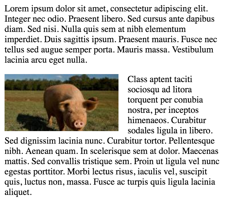
सरल दो फिक्स्ड-चौड़ाई कॉलम लेआउट
एक साधारण दो-स्तंभ लेआउट में दो निश्चित-चौड़ाई, फ्लोटेड तत्व होते हैं। ध्यान दें कि साइडबार और सामग्री क्षेत्र इस उदाहरण में समान ऊंचाई नहीं हैं। यह फ्लोट्स का उपयोग करते हुए मल्टी-कॉलम लेआउट के साथ मुश्किल भागों में से एक है, और कई कॉलम बनाने के लिए वर्कअराउंड की आवश्यकता होती है।
HTML:
<div class="wrapper">

<div class="sidebar">
  <h2>Sidebar</h2>

  <p>Lorem ipsum dolor sit amet, consectetur adipiscing elit. Integer nec odio.</p>
</div>

<div class="content">
  <h1>Content</h1>

  <p>Class aptent taciti sociosqu ad litora torquent per conubia nostra, per inceptos himenaeos. Curabitur sodales ligula in libero. Sed dignissim lacinia nunc. Curabitur tortor. Pellentesque nibh. Aenean quam. In scelerisque sem at dolor. Maecenas mattis. Sed convallis tristique sem. Proin ut ligula vel nunc egestas porttitor. Morbi lectus risus, iaculis vel, suscipit quis, luctus non, massa. Fusce ac turpis quis ligula lacinia aliquet. </p>
</div>

</div>
सीएसएस:
.wrapper {
  width:600px;
  padding:20px;
  background-color:pink;

  /* Floated elements don't use any height. Adding "overflow:hidden;" forces the
     parent element to expand to contain its floated children. */
  overflow:hidden;
}

.sidebar {
  width:150px;
  float:left;
  background-color:blue;
}

.content {
  width:450px;
  float:right;
  background-color:yellow;
}
सरल तीन निश्चित-चौड़ाई स्तंभ लेआउट
HTML:
<div class="wrapper">
  <div class="left-sidebar">
    <h1>Left Sidebar</h1>
    <p>Lorem ipsum dolor sit amet, consectetur adipiscing elit. </p>
  </div>
  <div class="content">
    <h1>Content</h1>
    <p>Class aptent taciti sociosqu ad litora torquent per conubia nostra, per inceptos himenaeos. Curabitur sodales ligula in libero. Sed dignissim lacinia nunc. Curabitur tortor. Pellentesque nibh. Aenean quam. In scelerisque sem at dolor. Maecenas mattis. Sed convallis tristique sem. Proin ut ligula vel nunc egestas porttitor. Morbi lectus risus, iaculis vel, suscipit quis, luctus non, massa. </p>
  </div>
  <div class="right-sidebar">
    <h1>Right Sidebar</h1>
    <p>Fusce ac turpis quis ligula lacinia aliquet.</p>
  </div>
</div>
सीएसएस:
.wrapper {
  width:600px;
  background-color:pink;
  padding:20px;

  /* Floated elements don't use any height. Adding "overflow:hidden;" forces the
     parent element to expand to contain its floated children. */
  overflow:hidden;
}

.left-sidebar {
  width:150px;
  background-color:blue;
  float:left;
}

.content {
  width:300px;
  background-color:yellow;
  float:left;
}

.right-sidebar {
  width:150px;
  background-color:green;
  float:right;
}
दो-स्तंभ आलसी / लालची लेआउट
यह लेआउट बिना किसी परिभाषित चौड़ाई के दो-स्तंभ लेआउट बनाने के लिए एक फ्लोटेड कॉलम का उपयोग करता है। इस उदाहरण में बायाँ साइडबार "आलसी" है, इसमें वह केवल उतनी ही जगह लेता है जितनी उसे जरूरत है। यह कहने का एक और तरीका यह है कि बाएं साइडबार "सिकुड़ा-लिपटे" है। सही सामग्री कॉलम "लालची" है, जिसमें यह शेष सभी स्थान लेता है।
HTML:
<div class="sidebar">
<h1>Sidebar</h1>
<img src="http://lorempixel.com/150/200/" />
</div>

<div class="content">
<h1>Content</h1>
<p>Lorem ipsum dolor sit amet, consectetur adipiscing elit. Integer nec odio. Praesent libero. Sed cursus ante dapibus diam. Sed nisi. Nulla quis sem at nibh elementum imperdiet. Duis sagittis ipsum. Praesent mauris. Fusce nec tellus sed augue semper porta. Mauris massa. Vestibulum lacinia arcu eget nulla. </p>
<p>Class aptent taciti sociosqu ad litora torquent per conubia nostra, per inceptos himenaeos. Curabitur sodales ligula in libero. Sed dignissim lacinia nunc. Curabitur tortor. Pellentesque nibh. Aenean quam. In scelerisque sem at dolor. Maecenas mattis. Sed convallis tristique sem. Proin ut ligula vel nunc egestas porttitor. Morbi lectus risus, iaculis vel, suscipit quis, luctus non, massa. Fusce ac turpis quis ligula lacinia aliquet. Mauris ipsum. Nulla metus metus, ullamcorper vel, tincidunt sed, euismod in, nibh. </p>
</div>
सीएसएस:
.sidebar {
  /* `display:table;` shrink-wraps the column */
  display:table;
  float:left;
  background-color:blue;
}

.content {
  /* `overflow:hidden;` prevents `.content` from flowing under `.sidebar` */
  overflow:hidden;
  background-color:yellow;
}
स्पष्ट संपत्ति
स्पष्ट संपत्ति सीधे तैरने से संबंधित है। सम्पत्ति की कीमत:
- कोई नहीं - डिफ़ॉल्ट। दोनों तरफ अस्थायी तत्वों की अनुमति देता है
- बाईं ओर - बाईं ओर किसी भी अस्थायी तत्वों की अनुमति नहीं है
- दाईं ओर - दाईं ओर कोई अस्थायी तत्व नहीं है
- दोनों - कोई भी अस्थायी तत्व बाईं या दाईं ओर की अनुमति नहीं देता है
- प्रारंभिक - इस संपत्ति को उसके डिफ़ॉल्ट मूल्य पर सेट करता है। प्रारंभिक के बारे में पढ़ें
- विरासत - अपने मूल तत्व से इस संपत्ति को प्राप्त करता है। विरासत के बारे में पढ़ें
<html>
<head>
<style>
img {
    float: left;
}

p.clear {
    clear: both;
}
</style>
</head>
<body>

<img src="https://static.pexels.com/photos/69372/pexels-photo-69372-medium.jpeg" width="100">
<p>Lorem ipsoum Lorem ipsoum Lorem ipsoum Lorem ipsoum Lorem ipsoum Lorem ipsoum Lorem ipsoum Lorem ipsoum Lorem ipsoum Lorem ipsoum Lorem ipsoum Lorem ipsoum </p>
<p class="clear">Lorem ipsoum Lorem ipsoum Lorem ipsoum Lorem ipsoum Lorem ipsoum Lorem ipsoum Lorem ipsoum Lorem ipsoum Lorem ipsoum Lorem ipsoum Lorem ipsoum Lorem ipsoum </p>

</body>
</html>
clearfix
क्लीयरफ़िक्स हैक एक लोकप्रिय तरीका है जिसमें फ़्लोट्स शामिल हैं (एन। गलाघेर उर्फ @ एनकोलस)
clear संपत्ति के साथ भ्रमित न होने के लिए, clear एक अवधारणा है (जो कि फ्लोट्स से संबंधित है, इस प्रकार संभव भ्रम है)। तैरता रखने के लिए आप को जोड़ने के लिए है .cf या .clearfix कंटेनर (पैरेंट) और शैली में कुछ नियमों के साथ इस वर्ग के नीचे वर्णित पर वर्ग।
थोड़ा अलग प्रभाव के साथ 3 संस्करण (स्रोत: एन। गैलाघर द्वारा एक नया माइक्रो क्लीयरफ़िक्स हैक और टीजे कोब्लेन्ट्ज़ द्वारा पुनः लोड किया गया):
क्लीयरफ़िक्स (शीर्ष फ़्लैग के समाप्त होने के साथ अभी भी होने वाली फ़्लोटिंग)
.cf:after {
    content: "";
    display: table;
}

.cf:after {
    clear: both;
}
क्लीयरफ़िक्स भी निहित फ़्लोट के शीर्ष मार्जिन को रोकने से रोकता है
/**
 * For modern browsers
 * 1. The space content is one way to avoid an Opera bug when the
 *    contenteditable attribute is included anywhere else in the document.
 *    Otherwise it causes space to appear at the top and bottom of elements
 *    that are clearfixed.
 * 2. The use of `table` rather than `block` is only necessary if using
 *    `:before` to contain the top-margins of child elements.
 */
.cf:before,
.cf:after {
    content: " "; /* 1 */
    display: table; /* 2 */
}

.cf:after {
    clear: both;
}
पुराने ब्राउज़र IE6 और IE7 के समर्थन के साथ उपसर्ग
.cf:before,
.cf:after {
    content: " ";
    display: table;
}

.cf:after {
    clear: both;
}

/**
 * For IE 6/7 only
 * Include this rule to trigger hasLayout and contain floats.
 */
.cf {
    *zoom: 1;
}
कोडस्क्रीन स्पष्ट प्रभाव दिखा रहा है
अन्य संसाधन: आप जो सब क्लियरफ़िक्स के बारे में जानते हैं वह गलत है (क्लीयरफ़िक्स और बीएफसी - ब्लॉक फ़ॉर्मेटिंग कॉनटेक्स्ट जबकि hasLayout पुराने ब्राउज़रों से संबंधित है IE6 शायद 7)
फ्लोट का उपयोग करके इन-लाइन DIV
div एक ब्लॉक-स्तरीय तत्व है, अर्थात यह पूरे पृष्ठ की चौड़ाई को घेरे हुए है और भाई-बहन अपनी चौड़ाई के बावजूद किसी भी स्थान पर नीचे स्थित हैं।
<div>
    <p>This is DIV 1</p>
</div>
<div>
    <p>This is DIV 2</p>
</div>
निम्नलिखित कोड का आउटपुट होगा 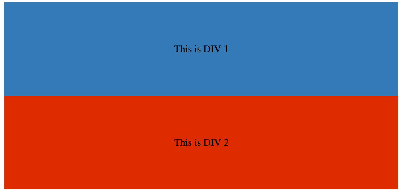
हम उन्हें div एक float css प्रॉपर्टी जोड़कर इन-लाइन बना सकते हैं।
HTML:
<div class="outer-div">
    <div class="inner-div1">
        <p>This is DIV 1</p>
    </div>
    <div class="inner-div2">
        <p>This is DIV 2</p>
    </div>
</div>
सीएसएस
.inner-div1 {
    width: 50%;
    margin-right:0px;
    float:left;
    background : #337ab7;
    padding:50px 0px;
}

.inner-div2 {
    width: 50%;
    margin-right:0px;
    float:left;
    background : #dd2c00;
    padding:50px 0px;
}

p {
    text-align:center;
}

फ्लोट को खाली करने के लिए अतिप्रवाह संपत्ति का उपयोग
किसी तत्व को hidden , auto या scroll करने के लिए overflow मान सेट करना, उस तत्व के सभी फ़्लोट्स को साफ़ कर देगा।
नोट: overflow:scroll का उपयोग करना overflow:scroll हमेशा स्क्रॉलबॉक्स दिखाएगा