CSS
사용자 지정 속성 (변수)
수색…
소개
CSS 변수를 사용하면 제작자가 CSS 문서 전체에서 사용할 수있는 재사용 가능한 값을 만들 수 있습니다.
예를 들어 CSS에서 문서 전체에 단일 색상을 재사용하는 것이 일반적입니다. CSS 변수를 사용하기 전에는 문서 전체에서 동일한 색상 값을 여러 번 재사용해야합니다. CSS 변수를 사용하면 색상 값을 변수에 할당하고 여러 위치에서 참조 할 수 있습니다. 따라서 값을 변경하는 것이 기존의 CSS 값을 사용하는 것보다 의미가 있습니다.
통사론
- : root {} / * 전역 클래스 정의를 허용하는 의사 클래스 * /
- - 변수 이름 : 값 ; / * 변수 정의 * /
- var (- variable-name, default-value ) / * 정의 된 변수를 기본값 fallback으로 사용 * /
비고
CSS 변수는 현재 실험적인 기술로 간주됩니다.
브라우저 지원 / 호환성
Firefox : 버전 31 이상 (기본값 : Enabled)
Chrome : 버전 49 이상 (기본값 : 사용)
experimental Web Platform 기능을 사용하도록 설정하여 Chrome 버전 48에서이 기능을 사용하도록 설정할 수 있습니다. 크롬 주소 표시 줄에 chrome://flags/ 를 입력하면이 설정에 액세스 할 수 있습니다. "
IE : 지원되지 않습니다.
Edge : 개발 중
Safari : 버전 9.1 이상
가변 색상
:root {
  --red: #b00;
  --blue: #4679bd;
  --grey: #ddd;
}
.Bx1 {
  color: var(--red);
  background: var(--grey);
  border: 1px solid var(--red);
}
가변 치수
:root {
  --W200: 200px;
  --W10: 10px;
}
.Bx2 {
  width: var(--W200);
  height: var(--W200);
  margin: var(--W10);
}
가변 계단식
CSS 변수는 다른 속성과 거의 같은 방법으로 캐스케이드되며 안전하게 다시 작성할 수 있습니다.
변수를 여러 번 정의 할 수 있으며 가장 높은 특이성을 가진 정의 만 선택된 요소에 적용됩니다.
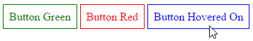
이 HTML 가정 :
<a class="button">Button Green</a>
<a class="button button_red">Button Red</a>
<a class="button">Button Hovered On</a>
이 CSS를 작성할 수 있습니다.
.button {
  --color: green;
  padding: .5rem;
  border: 1px solid var(--color);
  color: var(--color);
}

.button:hover {
  --color: blue;
}

.button_red {
  --color: red;
}
그리고이 결과를 얻으십시오 :
유효 / 무효
이름 지정 CSS 변수의 이름을 지정할 때 다른 CSS 속성 (예 : 줄 높이, -moz 상자 크기)과 같은 문자와 대시 만 포함되지만 이중 대시 (-)로 시작해야합니다
//These are Invalids variable names
--123color: blue;
--#color: red;
--bg_color: yellow
--$width: 100px;

//Valid variable names
--color: red;
--bg-color: yellow
--width: 100px;
CSS 변수는 대소 문자를 구분합니다.
/* The variable names below are all different variables */
--pcolor: ;
--Pcolor: ;
--pColor: ;
빈 대 공간
/* Invalid */
    --color:;

/* Valid */
  --color: ; /* space is assigned */
연결
    /* Invalid - CSS doesn't support concatenation*/
    .logo{
        --logo-url: 'logo';
        background: url('assets/img/' var(--logo-url) '.png');
    }

    /* Invalid - CSS bug */
    .logo{
        --logo-url: 'assets/img/logo.png';
        background: url(var(--logo-url));
    }

    /* Valid */
    .logo{
        --logo-url: url('assets/img/logo.png');
        background: var(--logo-url);
    }
유닛을 사용할 때주의하십시오.
    /* Invalid */
    --width: 10;
    width: var(--width)px;

    /* Valid */
    --width: 10px;
    width: var(--width);

    /* Valid */
    --width: 10;
    width: calc(1px * var(--width)); /* multiply by 1 unit to convert */
    width: calc(1em * var(--width));
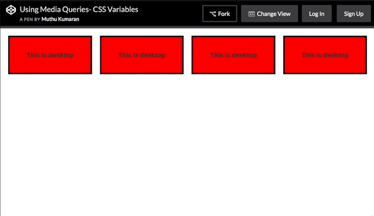
미디어 쿼리 포함
미디어 쿼리 내에서 변수를 다시 설정하고 사용 된 곳 어디에서나 새로운 값을 캐스케이드 할 수 있습니다. 이는 프리 프로세서 변수로는 불가능합니다.
여기서 미디어 쿼리는 매우 간단한 그리드를 설정하는 데 사용되는 변수를 변경합니다.
HTML
<div></div>
<div></div>
<div></div>
<div></div>
CSS
:root{
    --width: 25%;
    --content: 'This is desktop';
}
@media only screen and (max-width: 767px){
    :root{
        --width:50%;
        --content: 'This is mobile';
    }
}
@media only screen and (max-width: 480px){
    :root{
        --width:100%;
    }
}

div{
    width: calc(var(--width) - 20px);
    height: 100px;
}
div:before{
    content: var(--content);
}

/* Other Styles */
body {
    padding: 10px;
}

div{
    display: flex;
    align-items: center;
    justify-content: center;
    font-weight:bold;
    float:left;
    margin: 10px;
    border: 4px solid black;
    background: red;
}
이 CodePen 데모 에서 창 크기를 조정 해보십시오.
실제 크기 조정의 애니메이션 스크린 샷 :