サーチ…
構文
- クリア:なし|左|右|両方|インラインスタート|インライン・エンド;
- 浮動小数点:左|右|なし|インラインスタート|インライン・エンド;
備考
floatはブロックレイアウトの使用を意味するため、表示値の計算値を変更する場合もあります[1]
[1]: https : //developer.mozilla.org/en-US/docs/Web/CSS/float MDN
画像をテキスト内に浮かべる
浮動小数点の最も基本的な使い方は、画像の周りにテキストラップを持つことです。以下のコードは、2つの段落とイメージを生成し、2つ目の段落はイメージの周りを流れます。 float要素の周りを流れるfloat要素の後には、常に内容があることに注意してください。
HTML:
<p>Lorem ipsum dolor sit amet, consectetur adipiscing elit. Integer nec odio. Praesent libero. Sed cursus ante dapibus diam. Sed nisi. Nulla quis sem at nibh elementum imperdiet. Duis sagittis ipsum. Praesent mauris. Fusce nec tellus sed augue semper porta. Mauris massa. Vestibulum lacinia arcu eget nulla. </p>

<img src="http://lorempixel.com/200/100/" />

<p>Class aptent taciti sociosqu ad litora torquent per conubia nostra, per inceptos himenaeos. Curabitur sodales ligula in libero. Sed dignissim lacinia nunc. Curabitur tortor. Pellentesque nibh. Aenean quam. In scelerisque sem at dolor. Maecenas mattis. Sed convallis tristique sem. Proin ut ligula vel nunc egestas porttitor. Morbi lectus risus, iaculis vel, suscipit quis, luctus non, massa. Fusce ac turpis quis ligula lacinia aliquet. </p>
CSS:
img {
  float:left;
  margin-right:1rem;
}
これが出力になります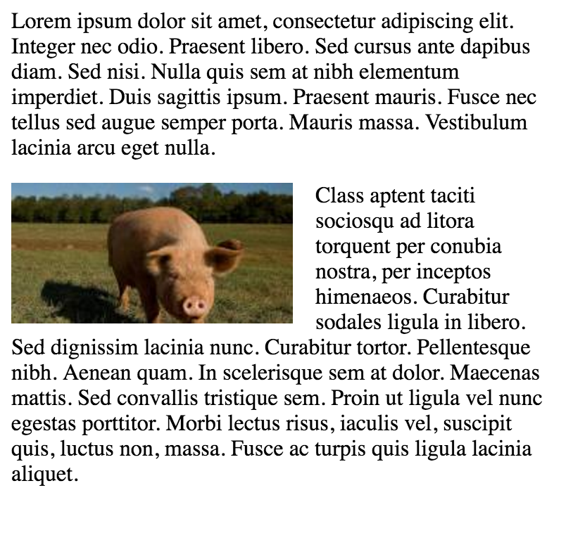
単純な2つの固定幅の列レイアウト
単純な2列のレイアウトは、2つの固定幅の浮動要素で構成されています。この例では、サイドバーとコンテンツ領域の高さが同じではありません。これは、浮動小数点数を使用する複数列のレイアウトの難しい部分の1つであり、複数の列を同じ高さに見せるための回避策が必要です。
HTML:
<div class="wrapper">

<div class="sidebar">
  <h2>Sidebar</h2>

  <p>Lorem ipsum dolor sit amet, consectetur adipiscing elit. Integer nec odio.</p>
</div>

<div class="content">
  <h1>Content</h1>

  <p>Class aptent taciti sociosqu ad litora torquent per conubia nostra, per inceptos himenaeos. Curabitur sodales ligula in libero. Sed dignissim lacinia nunc. Curabitur tortor. Pellentesque nibh. Aenean quam. In scelerisque sem at dolor. Maecenas mattis. Sed convallis tristique sem. Proin ut ligula vel nunc egestas porttitor. Morbi lectus risus, iaculis vel, suscipit quis, luctus non, massa. Fusce ac turpis quis ligula lacinia aliquet. </p>
</div>

</div>
CSS:
.wrapper {
  width:600px;
  padding:20px;
  background-color:pink;

  /* Floated elements don't use any height. Adding "overflow:hidden;" forces the
     parent element to expand to contain its floated children. */
  overflow:hidden;
}

.sidebar {
  width:150px;
  float:left;
  background-color:blue;
}

.content {
  width:450px;
  float:right;
  background-color:yellow;
}
単純な3つの固定幅の列レイアウト
HTML:
<div class="wrapper">
  <div class="left-sidebar">
    <h1>Left Sidebar</h1>
    <p>Lorem ipsum dolor sit amet, consectetur adipiscing elit. </p>
  </div>
  <div class="content">
    <h1>Content</h1>
    <p>Class aptent taciti sociosqu ad litora torquent per conubia nostra, per inceptos himenaeos. Curabitur sodales ligula in libero. Sed dignissim lacinia nunc. Curabitur tortor. Pellentesque nibh. Aenean quam. In scelerisque sem at dolor. Maecenas mattis. Sed convallis tristique sem. Proin ut ligula vel nunc egestas porttitor. Morbi lectus risus, iaculis vel, suscipit quis, luctus non, massa. </p>
  </div>
  <div class="right-sidebar">
    <h1>Right Sidebar</h1>
    <p>Fusce ac turpis quis ligula lacinia aliquet.</p>
  </div>
</div>
CSS:
.wrapper {
  width:600px;
  background-color:pink;
  padding:20px;

  /* Floated elements don't use any height. Adding "overflow:hidden;" forces the
     parent element to expand to contain its floated children. */
  overflow:hidden;
}

.left-sidebar {
  width:150px;
  background-color:blue;
  float:left;
}

.content {
  width:300px;
  background-color:yellow;
  float:left;
}

.right-sidebar {
  width:150px;
  background-color:green;
  float:right;
}
2列レイジー/グリーディーレイアウト
このレイアウトでは、1つの浮動列を使用して、幅が定義されていない2列のレイアウトを作成します。この例では、左側のサイドバーは必要なだけのスペースを占有するという点で「怠け者」です。これを言う別の方法は、左側のサイドバーが「シュリンクラップ」されていることです。正しい内容の列は、残りのすべての領域を占めるという点で「貪欲」です。
HTML:
<div class="sidebar">
<h1>Sidebar</h1>
<img src="http://lorempixel.com/150/200/" />
</div>

<div class="content">
<h1>Content</h1>
<p>Lorem ipsum dolor sit amet, consectetur adipiscing elit. Integer nec odio. Praesent libero. Sed cursus ante dapibus diam. Sed nisi. Nulla quis sem at nibh elementum imperdiet. Duis sagittis ipsum. Praesent mauris. Fusce nec tellus sed augue semper porta. Mauris massa. Vestibulum lacinia arcu eget nulla. </p>
<p>Class aptent taciti sociosqu ad litora torquent per conubia nostra, per inceptos himenaeos. Curabitur sodales ligula in libero. Sed dignissim lacinia nunc. Curabitur tortor. Pellentesque nibh. Aenean quam. In scelerisque sem at dolor. Maecenas mattis. Sed convallis tristique sem. Proin ut ligula vel nunc egestas porttitor. Morbi lectus risus, iaculis vel, suscipit quis, luctus non, massa. Fusce ac turpis quis ligula lacinia aliquet. Mauris ipsum. Nulla metus metus, ullamcorper vel, tincidunt sed, euismod in, nibh. </p>
</div>
CSS:
.sidebar {
  /* `display:table;` shrink-wraps the column */
  display:table;
  float:left;
  background-color:blue;
}

.content {
  /* `overflow:hidden;` prevents `.content` from flowing under `.sidebar` */
  overflow:hidden;
  background-color:yellow;
}
明確な特性
clearプロパティは浮動小数点数に直接関連しています。プロパティ値:
- none - デフォルト。両側のフローティング要素を許可する
- left - 左に浮動要素は使用できません
- 右 - 浮動要素は右側にありません
- 両方 - 左または右のいずれの側にも浮動要素は使用できません
- initial - このプロパティをデフォルト値に設定します。イニシャルについて読む
- inherit - このプロパティを親要素から継承します。継承について読む
<html>
<head>
<style>
img {
    float: left;
}

p.clear {
    clear: both;
}
</style>
</head>
<body>

<img src="https://static.pexels.com/photos/69372/pexels-photo-69372-medium.jpeg" width="100">
<p>Lorem ipsoum Lorem ipsoum Lorem ipsoum Lorem ipsoum Lorem ipsoum Lorem ipsoum Lorem ipsoum Lorem ipsoum Lorem ipsoum Lorem ipsoum Lorem ipsoum Lorem ipsoum </p>
<p class="clear">Lorem ipsoum Lorem ipsoum Lorem ipsoum Lorem ipsoum Lorem ipsoum Lorem ipsoum Lorem ipsoum Lorem ipsoum Lorem ipsoum Lorem ipsoum Lorem ipsoum Lorem ipsoum </p>

</body>
</html>
クリアフィックス
clearfixハックは、浮動小数点数を含める一般的な方法です(N. Gallagher aka @necolas)
clearプロパティと混同しないように、clearfixはコンセプトです (これは浮動小数点数にも関係するため、混乱の可能性があります)。 浮動小数点数を含めるには、コンテナ( 親 )に.cfまたは.clearfixクラスを追加し、このクラスのスタイルをいくつかのルールで記述します。
わずかに異なる効果を持つ3つのバージョン(ソース: 新しいマイクロclearfixハック N.ギャラガーによってリロードclearfix TJ Koblentzによって)。
Clearfix(含まれている浮動小数点数の上余白が残っている)
.cf:after {
    content: "";
    display: table;
}

.cf:after {
    clear: both;
}
含まれているフロートの上部マージンの崩壊を防ぐClearfix
/**
 * For modern browsers
 * 1. The space content is one way to avoid an Opera bug when the
 *    contenteditable attribute is included anywhere else in the document.
 *    Otherwise it causes space to appear at the top and bottom of elements
 *    that are clearfixed.
 * 2. The use of `table` rather than `block` is only necessary if using
 *    `:before` to contain the top-margins of child elements.
 */
.cf:before,
.cf:after {
    content: " "; /* 1 */
    display: table; /* 2 */
}

.cf:after {
    clear: both;
}
古いブラウザIE6とIE7のサポートによるClearfix
.cf:before,
.cf:after {
    content: " ";
    display: table;
}

.cf:after {
    clear: both;
}

/**
 * For IE 6/7 only
 * Include this rule to trigger hasLayout and contain floats.
 */
.cf {
    *zoom: 1;
}
その他のリソース: clearfixについて知っていることはすべて間違っています (clearfixとBFC - Block Formatting Context、hasLayoutは古くなったブラウザIE6に関係するかもしれません)
フロートを使用したインラインDIV
divはブロックレベルの要素です。つまり、ページ幅の全体を占め、兄弟は幅に関係なく上下に配置されます。
<div>
    <p>This is DIV 1</p>
</div>
<div>
    <p>This is DIV 2</p>
</div>
次のコードの出力は次のようになります。 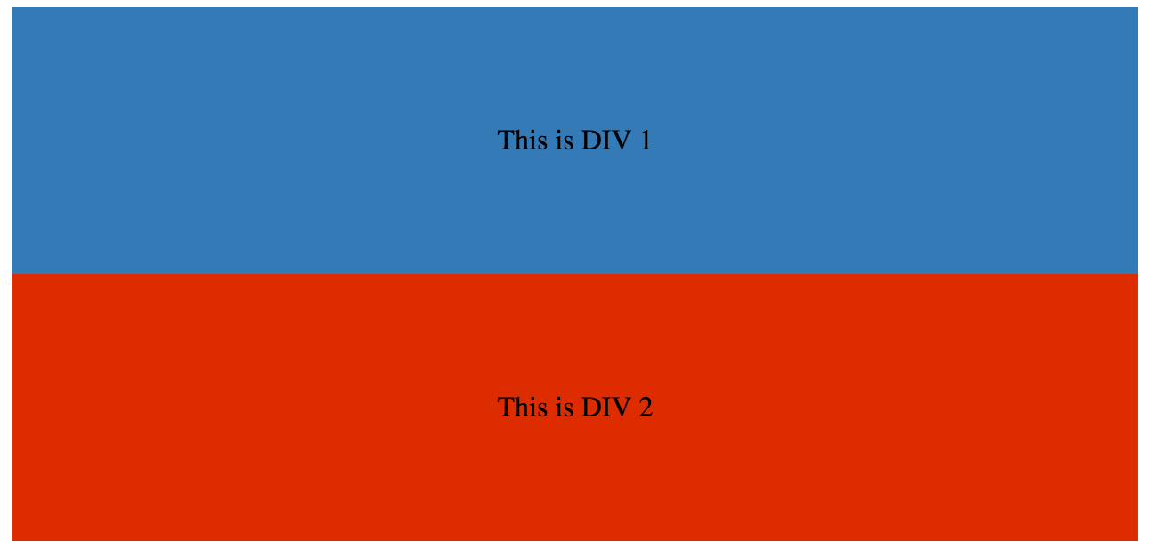
div float cssプロパティを追加することで、それらをインラインで作ることができます。
HTML:
<div class="outer-div">
    <div class="inner-div1">
        <p>This is DIV 1</p>
    </div>
    <div class="inner-div2">
        <p>This is DIV 2</p>
    </div>
</div>
CSS
.inner-div1 {
    width: 50%;
    margin-right:0px;
    float:left;
    background : #337ab7;
    padding:50px 0px;
}

.inner-div2 {
    width: 50%;
    margin-right:0px;
    float:left;
    background : #dd2c00;
    padding:50px 0px;
}

p {
    text-align:center;
}

フロートをクリアするためのオーバーフロープロパティの使用
overflow値をhidden 、 autoまたはscrollするように設定すると、その要素内のすべての浮動小数点数がクリアされます。
注: overflow:scrollを使用すると常にoverflow:scrollボックスが表示されます