twitter-bootstrap 튜토리얼
트위터 부트 스트랩 시작하기
수색…
비고
부트 스트랩은 모바일 우선 패러다임과 반응 형 웹 디자인 (RWD)을 사용하여 생성 된 웹 사이트를 만드는 데 사용되는 HTML, CSS 및 JavaScript 프레임 워크입니다. 그것은 premade CSS 클래스와 JavaScript의 조합을 사용하여 웹상에서 다양한 것을 만듭니다. 웹 사이트를 모든 화면에서 볼 수있게 해주는 맞춤형 반응 형 그리드, 응답 성이 뛰어난 드롭 다운 탐색 표시기, 미리 만들어진 버튼, 양식 및 아코디언과 같은 시간 집중적 인 간단한 작업 등이 포함되어 있습니다. 조금.
부트 스트랩은 다음과 같은 이유로 유용 할 수 있습니다.
시간 절약 : 부트 스트랩은 사전 작성된 많은 기능을 갖추고 있으며 코드를 작성할 때 간단하게 호출해야합니다. 이렇게하면 상당한 시간을 절약 할 수 있으며 웹 사이트를 코딩하는 데 필요한 시간을 크게 단축 할 수 있습니다.
반응 형 웹 디자인을 염두에두고 제작되었습니다 . Bootstrap은 웹 개발자가 화면 크기에 따라 확장되는 것을 만들지 않을 수있게 해줍니다. Bootstrap은 모든 스크린에서 작동 할 수있는 모바일 우선 응답 디자인을 사용하기 때문에 크기.
디자인 프로세스 간소화 : 부트 스트랩에는 훌륭한 설계 방법을 갖춘 요소가 미리 준비되어 있습니다. 이것은 웹 디자인 기술이 그렇게 좋지 않은 사람들이나 디자인을 지루한 작업으로 보는 사람들에게 유용 할 수 있습니다. 많은 Bootstrap 클래스는 심미적으로 즐겁고보기 좋은 곳입니다.
이 섹션에서는 트위터 부트 스트랩 내의 큰 주제에 대해 언급하고 관련 주제에 링크해야합니다. 트위터 부트 스트랩에 대한 문서는 새로운 것이므로 관련 주제의 초기 버전을 만들어야 할 수도 있습니다.
버전
| 번역 | 출시일 |
|---|---|
| 4.0 | 2999-01-01 |
| 3.3.7 | 2016-07-25 |
| 3.3.6 | 2015-11-24 |
| 3.3.5 | 2015-06-15 |
| 3.3.4 | 2015-03-16 |
| 3.3.1 | 2014-11-12 |
| 3.3.0 | 2014-10-29 |
| 3.2.0 | 2014-06-26 |
| 3.1.0 | 2014-01-30 |
| 3.0 | 2013 년 8 월 19 일 |
| 2.3 | 2013-02-07 |
| 2.2 | 2012-10-29 |
| 2.1 | 2012-08-20 |
| 2.0 | 2012-02-01 |
| 1.0 | 2011 년 8 월 18 일 |
설치 / 설정
다운로드 중 :
- GitHub 저장소에서 직접 부트 스트랩을 다운로드하거나 복제하십시오.
- 공식 문서 에서 사용자 정의 된 버전의 Bootstrap을 다운로드하십시오.
-
bower install bootstrap:bower install bootstrap -
npm install bootstrap:npm install bootstrap - 작곡가와 함께 설치 :
composer require twbs/bootstrap.
파일 구조 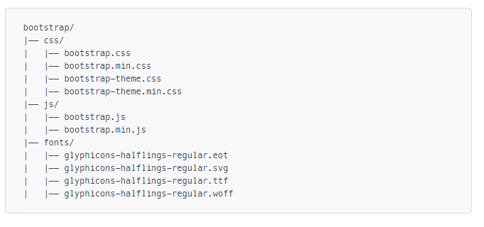
설치 중 :
HTML 페이지에서 Bootstrap의 CSS, JS 및 jQuery의 종속성 (적어도 최신 Bootstrap 버전의 경우 이전 버전 3)을 포함하십시오. 부트 스트랩의 자바 스크립트 기능을 사용할 계획이라면, jQuery 레퍼런스는 HTML 내의 bootstrap.js 레퍼런스 보다 먼저 나와야한다.
설치된 부트 스트랩 파일을 위 섹션에서 활용하거나 부트 스트랩 제작자가 제공 한 CDN ( 부트 스트랩 시작하기 에서 가져온 링크)을 참조 할 수 있습니다.
<!-- Latest compiled and minified CSS -->
<link rel="stylesheet" href="https://maxcdn.bootstrapcdn.com/bootstrap/3.3.7/css/bootstrap.min.css" integrity="sha384-BVYiiSIFeK1dGmJRAkycuHAHRg32OmUcww7on3RYdg4Va+PmSTsz/K68vbdEjh4u" crossorigin="anonymous">

<!-- Optional theme -->
<link rel="stylesheet" href="https://maxcdn.bootstrapcdn.com/bootstrap/3.3.7/css/bootstrap-theme.min.css" integrity="sha384-rHyoN1iRsVXV4nD0JutlnGaslCJuC7uwjduW9SVrLvRYooPp2bWYgmgJQIXwl/Sp" crossorigin="anonymous">

<!-- Latest compiled and minified JavaScript -->
<script src="https://maxcdn.bootstrapcdn.com/bootstrap/3.3.7/js/bootstrap.min.js" integrity="sha384-Tc5IQib027qvyjSMfHjOMaLkfuWVxZxUPnCJA7l2mCWNIpG9mGCD8wGNIcPD7Txa" crossorigin="anonymous"></script>
아주 기본적인 부트 스트랩 웹 페이지 :
<!DOCTYPE html>
<html lang="en">
  <head>
    <meta charset="utf-8">
    <meta http-equiv="X-UA-Compatible" content="IE=edge">
    <meta name="viewport" content="width=device-width, initial-scale=1">
    <!-- The above 3 meta tags *must* come first in the head; any other head content must come *after* these tags -->
    <title>Bootstrap 101 Template</title>

    <!-- Bootstrap -->
    <link href="css/bootstrap.min.css" rel="stylesheet">

    <!-- HTML5 shim and Respond.js for IE8 support of HTML5 elements and media queries -->
    <!-- WARNING: Respond.js doesn't work if you view the page via file:// -->
    <!--[if lt IE 9]>
      <script src="https://oss.maxcdn.com/html5shiv/3.7.2/html5shiv.min.js"></script>
      <script src="https://oss.maxcdn.com/respond/1.4.2/respond.min.js"></script>
    <![endif]-->
  </head>
  <body>
    <h1>Hello, world!</h1>

    <!-- jQuery (necessary for Bootstrap's JavaScript plugins) -->
    <script src="https://ajax.googleapis.com/ajax/libs/jquery/1.11.3/jquery.min.js"></script>
    <!-- Include all compiled plugins (below), or include individual files as needed -->
    <script src="js/bootstrap.min.js"></script>
  </body>
</html>
기본 템플릿
<!DOCTYPE html>
<html lang="en">

    <head>

        <meta charset="utf-8">
        <meta http-equiv="X-UA-Compatible" content="IE=edge">
        <meta name="viewport" content="width=device-width, initial-scale=1">
        <!-- The above 3 meta tags *must* come first in the head; any other head content must come *after* these tags -->


        <title>Bootstrap 101 Template</title>  <!-- The title of the Website -->


        <!-- Reference to Bootstrap's CSS file -->
        <!-- This is the line to reference the bootstrap's Stylesheet -->
        <link href="css/bootstrap.min.css" rel="stylesheet">


        <!-- HTML5 shim and Respond.js for IE8 support of HTML5 elements and media queries -->
        <!-- WARNING: Respond.js doesn't work if you view the page via file:// -->
        <!-- [if lt IE 9] -->
         <script src="https://oss.maxcdn.com/html5shiv/3.7.2/html5shiv.min.js"></script>
         <script src="https://oss.maxcdn.com/respond/1.4.2/respond.min.js"></script>
        <!--[endif]-->


    </head>

    <body>

        <h1>Hello, world!</h1>

        <!-- Referencing jQuery (necessary for Bootstrap JavaScript plugins(bootstrap.min.js) to work) -->
        <script src = "https://ajax.googleapis.com/ajax/libs/jquery/1.11.3/jquery.min.js"></script>


        <!-- Referencing Javascript Bootstrap Plugin to Facilitate Bootstrap Animations and functionalities. -->
        <!-- (Necessary to run Bootstrap) -->
        <script src="js/bootstrap.min.js"></script>


    </body>
</html>
부트 스트랩 사용시기
부트 스트랩은 HTML, CSS 및 Javascript에 대한 독창적 인 프레임 워크입니다. 여기에는 양식 요소, 버튼, 모달 창 및 탐색 요소와 같은 [사용자 인터페이스] 요소가 수용된 기본 스타일 및 기능이 포함되어 있습니다.
부트 스트랩은 반응이 빠른 웹 프레임 워크로서 모바일 장치, 태블릿 및 데스크탑 컴퓨터와 같은 크고 작은 화면 크기와 레이아웃을 모두 단일 코드 기반으로 조정할 수 있도록 설계되었습니다.
부트 스트랩의 기본 개념 중 하나는 그리드 프레임 워크입니다. HTML 요소에 클래스를 적용하여 기본 열 12 열을 사용하여 복잡한 레이아웃을 만들 수 있습니다. 예를 들어, 4 열 레이아웃은 태블릿 장치의 두 열과 모바일 장치의 한 열에 적용될 수 있습니다. 그리드는이를 달성하기 위해 특정 화면 크기를 타겟팅하기위한 CSS 방법 인 media queries 사용합니다.
부트 스트랩은 다음과 같은 경우에 특히 유용합니다.
- 맞춤 디자인이 최우선 순위는 아닙니다.
- 사용자 정의 CSS를 작성하는 것보다 HTML을 편집하고 클래스를 추가하는 것이 더 편합니다.
- 다른 많은 웹 사이트와 시각적 유사점이 많은 프레임 워크를 사용하는 것이 편안합니다.
HTML, CSS 및 Javascript를 처음 사용하는 사용자는 부트 스트랩을 사용할 수 있습니다. 문서 가 훌륭하기 때문입니다. 그러나 Bootstrap (HTML, CSS 및 Javascript)에서 사용하는 세 가지 기본 기술을 완전히 익히지 않은 사람들을위한 학습 곡선이 있습니다.
Bootstrap의 스타일이나 기능을 변경하기 위해 Bootstrap 테마를 구매하거나 다운로드 할 수 있습니다. 또한 CSS와 자바 스크립트의 사용자 정의와 함께 시작 지점으로 부트 스트랩을 사용할 수도 있습니다.
부트 스트랩 구성 요소를 사용하는 기본 웹 페이지
<!DOCTYPE html>
<html lang="en">
<head>
<meta charset="utf-8">
<meta http-equiv="X-UA-Compatible" content="IE=edge">
<meta name="viewport" content="width=device-width, initial-scale=1">
<!-- The above 3 meta tags *must* come first in the head; any other head content must come *after* these tags -->
<title>Bootstrap 101 Template</title>
<!-- Bootstrap -->
<link href="css/bootstrap.min.css" rel="stylesheet">
<!-- HTML5 shim and Respond.js for IE8 support of HTML5 elements and media queries -->
<!-- WARNING: Respond.js doesn't work if you view the page via file:// -->
<!--[if lt IE 9]>
<script src="https://oss.maxcdn.com/html5shiv/3.7.2/html5shiv.min.js"></script>
<script src="https://oss.maxcdn.com/respond/1.4.2/respond.min.js"></script>
<![endif]-->
</head>
<body>
<!-- Fixed navbar -->
<nav class="navbar navbar-default navbar-fixed-top">
<div class="container">
<div class="navbar-header">
<button type="button" class="navbar-toggle collapsed" data-toggle="collapse" data-target="#navbar" aria-expanded="false" aria-controls="navbar">
<span class="sr-only">Toggle navigation</span>
<span class="icon-bar"></span>
<span class="icon-bar"></span>
<span class="icon-bar"></span>
</button>
<a class="navbar-brand" href="#">Project name</a>
</div>
<div id="navbar" class="navbar-collapse collapse">
<ul class="nav navbar-nav">
<li class="active"><a href="#">Home</a></li>
<li><a href="#about">About</a></li>
<li><a href="#contact">Contact</a></li>
<li class="dropdown">
<a href="#" class="dropdown-toggle" data-toggle="dropdown" role="button" aria-haspopup="true" aria-expanded="false">Dropdown <span class="caret"></span></a>
<ul class="dropdown-menu">
<li><a href="#">Action</a></li>
<li><a href="#">Another action</a></li>
<li><a href="#">Something else here</a></li>
<li role="separator" class="divider"></li>
<li class="dropdown-header">Nav header</li>
<li><a href="#">Separated link</a></li>
<li><a href="#">One more separated link</a></li>
</ul>
</li>
</ul>
<ul class="nav navbar-nav navbar-right">
<li><a href="../navbar/">Default</a></li>
<li><a href="../navbar-static-top/">Static top</a></li>
<li class="active"><a href="./">Fixed top <span class="sr-only">(current)</span></a></li>
</ul>
</div><!--/.nav-collapse -->
</div>
</nav>
<div class="container">
<div class="jumbotron">
<h1>Navbar example</h1>
<p>This example is a quick exercise to illustrate how the default, static and fixed to top navbar work. It includes the responsive CSS and HTML, so it also adapts to your viewport and device.</p>
<p>To see the difference between static and fixed top navbars, just scroll.</p>
<p>
<a class="btn btn-lg btn-primary" href="../../components/#navbar" role="button">View navbar docs »</a>
</p>
</div>
</div> <!-- /container -->
<!-- jQuery (necessary for Bootstrap's JavaScript plugins) -->
<script src="https://ajax.googleapis.com/ajax/libs/jquery/1.11.3/jquery.min.js"></script>
<!-- Include all compiled plugins (below), or include individual files as needed -->
<script src="js/bootstrap.min.js"></script>
</body>
</html>