CSS
Performance
Recherche…
Utilisez transform et opacity pour éviter la mise en page du trigger
La modification de certains attributs CSS déclenchera le navigateur pour calculer de manière synchrone le style et la disposition, ce qui est une mauvaise chose lorsque vous devez animer à 60 images par seconde.
Ne pas
Animer avec la disposition des déclencheurs à left et en top .
#box {
  left: 0;
  top: 0;
  transition: left 0.5s, top 0.5s;
  position: absolute;
  width: 50px;
  height: 50px;
  background-color: gray;
}

#box.active {
  left: 100px;
  top: 100px;
}
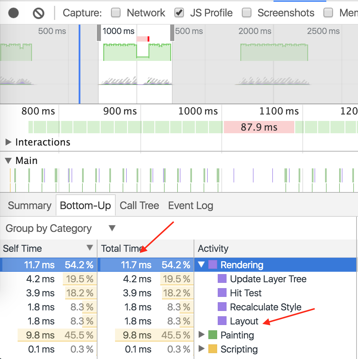
La démo a pris 11,7 ms pour le rendu, 9,8 ms pour la peinture
FAIRE
Animer avec transform avec la même animation.
#box {
  left: 0;
  top: 0;
  position: absolute;
  width: 50px;
  height: 50px;
  background-color: gray;

  transition: transform 0.5s;
  transform: translate3d(0, 0, 0);
}

#box.active {
  transform: translate3d(100px, 100px, 0);
}
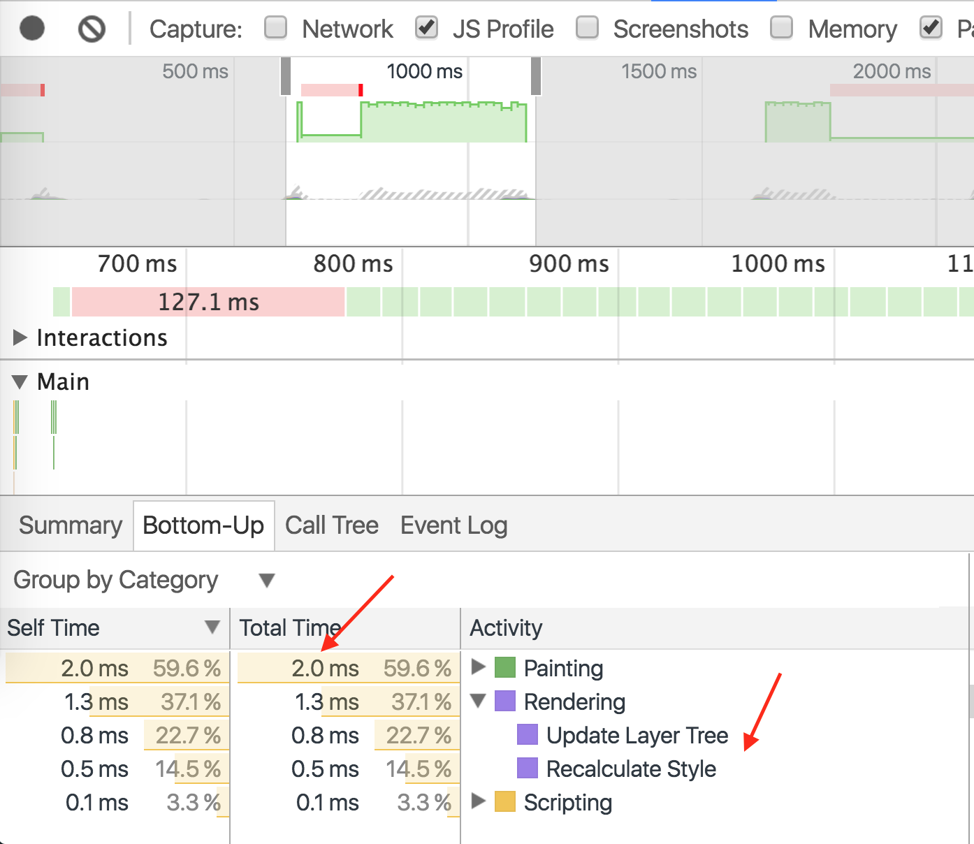
Demo même animation, prend 1,3ms pour le rendu, 2.0ms pour la peinture.
Modified text is an extract of the original Stack Overflow Documentation
Sous licence CC BY-SA 3.0
Non affilié à Stack Overflow