twitter-bootstrap-3
twitter-bootstrap-3의 버튼들
수색…
twitter-bootstrap`btn` 클래스 사용하기
Twitter-bootstrap의 btn 클래스는 다음 html 요소 중 하나와 함께 사용할 수 있습니다.
- 닻
- 단추
-
with both type="button" and type="submit"
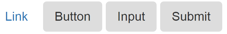
다음은 btn 클래스의 모든 가능한 사용 사례의 예입니다.
<a class="btn" href="#" role="button">Link</a>
<button class="btn" type="submit">Button</button>
<input class="btn" type="button" value="Input">
<input class="btn" type="submit" value="Submit">
위의 네 가지 방법 중 하나에서 btn 클래스를 사용할 수 있지만 가능한 경우 <button> 요소를 사용하는 것이 좋습니다.
위의 코드 이미지가 아래에 첨부되어 있습니다.
twitter-bootstrap-3에있는 서로 다른 크기의 버튼
twitter-bootstrap-3는 4 가지 크기의 버튼을 제공합니다.
- 대형 버튼
btn-lg - 기본 버튼
does not require any btn size - 작은 버튼
btn-sm - 추가 버튼
btn-xs
 <button type="button" class="btn  btn-lg">Large button</button>
 <button type="button" class="btn">Default button</button>
 <button type="button" class="btn  btn-sm">Small button</button>
 <button type="button" class="btn  btn-xs">Extra small button</button>
위의 코드 이미지가 아래에 첨부되어 있습니다. 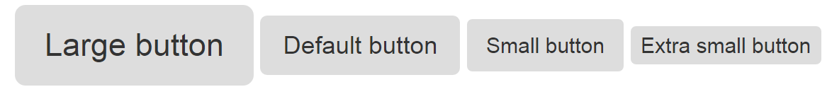
단추에 글리프 콘 추가
Glyphicon은 텍스트, 버튼, 툴바, 탐색, 양식 등에서 사용할 수 있습니다 (출처 : W3Schools). Glyphicon은 기본적으로 앞서 말한 스타일로 사용할 수있는 아이콘 형태입니다. 이 예는, 글리프 콘형의 클래스를 가지는 버튼의 내부의 스팬을 사용하는 것에 의해, 2 종류의 버튼의 내부에있는 글리 phicon의 사용법의 개요를 나타냅니다.
HTML 버튼
<button type="button" class="btn btn-info">
    <span class="glyphicon glyphicon-search"></span> Search
</button>

ASP 버튼
<asp:LinkButton runat="server" CssClass="btn btn-info" >
    <span class="glyphicon glyphicon-envelope"></span> Email
</asp:LinkButton>

Modified text is an extract of the original Stack Overflow Documentation
아래 라이선스 CC BY-SA 3.0
와 제휴하지 않음 Stack Overflow