Xamarin.Forms
ज़ामरीन फॉर्मूले
खोज…
ContentPresenter
अस्थायी विचारों के लिए एक लेआउट प्रबंधक। एक ControlTemplate के भीतर जहां चिह्नित किया जाना है सामग्री प्रस्तुत करने के लिए प्रयोग किया जाता है।
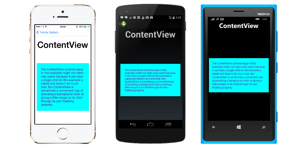
contentView
एकल सामग्री वाला एक तत्व। ContentView का अपना बहुत कम उपयोग है। इसका उद्देश्य उपयोगकर्ता-परिभाषित यौगिक विचारों के लिए एक आधार वर्ग के रूप में सेवा करना है।
XAML
<ContentView>
<Label Text="Hi, I'm a simple Label inside of a simple ContentView"
HorizontalOptions="Center"
VerticalOptions="Center"/>
</ContentView>
कोड
var contentView = new ContentView {
Content = new Label {
 Text = "Hi, I'm a simple Label inside of a simple ContentView",
 HorizontalOptions = LayoutOptions.Center,
 VerticalOptions = LayoutOptions.Center
}
};
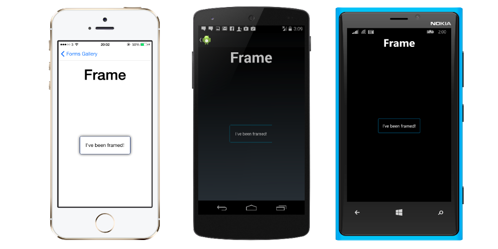
ढांचा
एक तत्व जिसमें एकल बच्चा होता है, जिसमें कुछ फ्रेमिंग विकल्प होते हैं। फ़्रेम में एक डिफ़ॉल्ट Xamarin.Forms.Layout.Padding 20 है।
XAML
<Frame>
<Label Text="I've been framed!"
HorizontalOptions="Center"
VerticalOptions="Center" />
</Frame>
कोड
var frameView = new Frame {
Content = new Label {
 Text = "I've been framed!",
HorizontalOptions = LayoutOptions.Center,
VerticalOptions = LayoutOptions.Center
},
OutlineColor = Color.Red
};
scrollview
Content आवश्यकता होने पर स्क्रॉल करने में सक्षम एक तत्व।
ScrollView में लेआउट हैं और उन्हें ऑफ़स्क्रीन स्क्रॉल करने में सक्षम बनाता है। ScrollView का उपयोग कीबोर्ड के प्रदर्शित होने पर स्क्रीन के दृश्य भाग में स्वचालित रूप से स्थानांतरित करने की अनुमति देने के लिए भी किया जाता है।
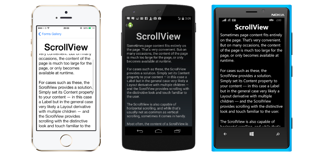
ध्यान दें: ScrollViews नेस्टेड नहीं होना चाहिए। इसके अलावा, ScrollViews को अन्य नियंत्रणों के साथ नेस्ट नहीं किया जाना चाहिए जो ListView और WebView तरह स्क्रॉलिंग प्रदान करते हैं।
एक ScrollView को परिभाषित करना आसान है। XAML में:
<ContentPage.Content>
    <ScrollView>
        <StackLayout>
            <BoxView BackgroundColor="Red" HeightRequest="600" WidthRequest="150" />
            <Entry />
        </StackLayout>
    </ScrollView>
</ContentPage.Content>
कोड में समान परिभाषा:
var scroll = new ScrollView();
Content = scroll;
var stack = new StackLayout();
stack.Children.Add(new BoxView { BackgroundColor = Color.Red,   HeightRequest = 600, WidthRequest = 600 });
stack.Children.Add(new Entry());
TemplatedView
एक तत्व जो कंटेंट को एक कंट्रोल टेम्प्लेट, और ContentView लिए बेस क्लास प्रदर्शित करता है।
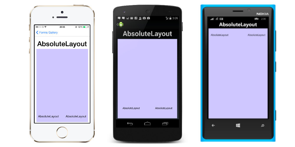
AbsoluteLayout
AbsoluteLayout पदों और आकार बाल तत्वों अपने स्वयं के आकार और स्थिति के लिए आनुपातिक या पूर्ण मूल्यों से। आनुपातिक मूल्यों या स्थिर मूल्यों का उपयोग करके बाल विचारों को तैनात और आकार दिया जा सकता है, और आनुपातिक और स्थिर मूल्यों को मिलाया जा सकता है।
XAML में एक AbsoluteLayout की परिभाषा इस तरह दिखती है:
<AbsoluteLayout>
    <Label Text="I'm centered on iPhone 4 but no other device"
        AbsoluteLayout.LayoutBounds="115,150,100,100" LineBreakMode="WordWrap"  />
    <Label Text="I'm bottom center on every device."
        AbsoluteLayout.LayoutBounds=".5,1,.5,.1" AbsoluteLayout.LayoutFlags="All"
        LineBreakMode="WordWrap"  />
    <BoxView Color="Olive"  AbsoluteLayout.LayoutBounds="1,.5, 25, 100"
        AbsoluteLayout.LayoutFlags="PositionProportional" />
    <BoxView Color="Red" AbsoluteLayout.LayoutBounds="0,.5,25,100"
        AbsoluteLayout.LayoutFlags="PositionProportional" />
    <BoxView Color="Blue" AbsoluteLayout.LayoutBounds=".5,0,100,25"
        AbsoluteLayout.LayoutFlags="PositionProportional" />
    <BoxView Color="Blue" AbsoluteLayout.LayoutBounds=".5,0,1,25"
        AbsoluteLayout.LayoutFlags="PositionProportional, WidthProportional" />
</AbsoluteLayout>
एक ही लेआउट कोड में इस तरह दिखेगा:
Title = "Absolute Layout Exploration - Code";
var layout = new AbsoluteLayout();

var centerLabel = new Label {
Text = "I'm centered on iPhone 4 but no other device.",
LineBreakMode = LineBreakMode.WordWrap};

AbsoluteLayout.SetLayoutBounds (centerLabel, new Rectangle (115, 159, 100, 100));
// No need to set layout flags, absolute positioning is the default

var bottomLabel = new Label { Text = "I'm bottom center on every device.", LineBreakMode = LineBreakMode.WordWrap };
AbsoluteLayout.SetLayoutBounds (bottomLabel, new Rectangle (.5, 1, .5, .1));
AbsoluteLayout.SetLayoutFlags (bottomLabel, AbsoluteLayoutFlags.All);

var rightBox = new BoxView{ Color = Color.Olive };
AbsoluteLayout.SetLayoutBounds (rightBox, new Rectangle (1, .5, 25, 100));
AbsoluteLayout.SetLayoutFlags (rightBox, AbsoluteLayoutFlags.PositionProportional);

var leftBox = new BoxView{ Color = Color.Red };
AbsoluteLayout.SetLayoutBounds (leftBox, new Rectangle (0, .5, 25, 100));
AbsoluteLayout.SetLayoutFlags (leftBox, AbsoluteLayoutFlags.PositionProportional);

var topBox = new BoxView{ Color = Color.Blue };
AbsoluteLayout.SetLayoutBounds (topBox, new Rectangle (.5, 0, 100, 25));
AbsoluteLayout.SetLayoutFlags (topBox, AbsoluteLayoutFlags.PositionProportional);

var twoFlagsBox = new BoxView{ Color = Color.Blue };
AbsoluteLayout.SetLayoutBounds (topBox, new Rectangle (.5, 0, 1, 25));
AbsoluteLayout.SetLayoutFlags (topBox, AbsoluteLayoutFlags.PositionProportional | AbsoluteLayout.WidthProportional);

layout.Children.Add (bottomLabel);
layout.Children.Add (centerLabel);
layout.Children.Add (rightBox);
layout.Children.Add (leftBox);
layout.Children.Add (topBox);
Xamarin.Forms में AbsoluteLayout नियंत्रण आपको यह निर्दिष्ट करने की अनुमति देता है कि स्क्रीन पर वास्तव में आप बाल तत्वों को कहां दिखाना चाहते हैं, साथ ही साथ उनका आकार और आकार (सीमा) भी।
इस प्रक्रिया के दौरान उपयोग किए जाने वाले AbsoluteLayoutFlags गणन के आधार पर बाल तत्वों की सीमा निर्धारित करने के लिए कुछ अलग तरीके हैं। AbsoluteLayoutFlags गणना में निम्नलिखित मान शामिल हैं:
- सभी : सभी आयाम आनुपातिक हैं।
- HeightProportional : ऊँचाई लेआउट के लिए आनुपातिक है।
- कोई नहीं : कोई व्याख्या नहीं की गई है।
- PositionProportional: जोड़ती है XProportional और YProportional।
- SizeProportional : WidthProportional और HeightProportional को जोड़ती है।
- WidthProportional : चौड़ाई लेआउट के लिए आनुपातिक है।
- XProportional : X संपत्ति लेआउट के लिए आनुपातिक है।
- YProportional : Y संपत्ति लेआउट के लिए आनुपातिक है।
AbsoluteLayout कंटेनर के लेआउट के साथ काम करने की प्रक्रिया पहली बार में थोड़ी उल्टी लग सकती है, लेकिन थोड़े से उपयोग से यह परिचित हो जाएगा। एक बार जब आप अपने बच्चे के तत्वों को बना लेते हैं, तो उन्हें कंटेनर के भीतर एक पूर्ण स्थिति में स्थापित करने के लिए आपको तीन चरणों का पालन करना होगा। आप AbsoluteLayout.SetLayoutFlags () विधि का उपयोग करके तत्वों को सौंपे गए झंडे सेट करना चाहेंगे। आप तत्वों को उनकी सीमा देने के लिए AbsoluteLayout.SetLayoutBounds () विधि का उपयोग करना चाहते हैं। अंत में, आप बाल तत्वों को बच्चों के संग्रह में जोड़ना चाहेंगे। चूंकि Xamarin.Forms Xamarin और डिवाइस-विशिष्ट कार्यान्वयनों के बीच एक अमूर्त परत है, इसलिए स्थितीय मान डिवाइस पिक्सेल से स्वतंत्र हो सकते हैं। यह वह जगह है जहाँ पहले बताए गए लेआउट फ़्लैग्स चलन में आते हैं। आप चुन सकते हैं कि Xamarin.Forms नियंत्रण की लेआउट प्रक्रिया आपके द्वारा परिभाषित मूल्यों की व्याख्या कैसे करें।
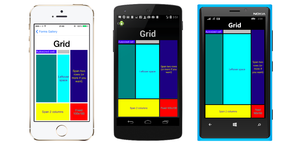
ग्रिड
पंक्तियों और स्तंभों में व्यवस्थित विचारों वाला एक लेआउट।
यह XAML में एक विशिष्ट Grid परिभाषा है।
<Grid>
  <Grid.RowDefinitions>
    <RowDefinition Height="2*" />
    <RowDefinition Height="*" />
    <RowDefinition Height="200" />
  </Grid.RowDefinitions>
  <Grid.ColumnDefinitions>
    <ColumnDefinition Width="Auto" />
    <ColumnDefinition Width="*" />
  </Grid.ColumnDefinitions>

  <ContentView Grid.Row="0" Grid.Column="0"/>
  <ContentView Grid.Row="1" Grid.Column="0"/>
  <ContentView Grid.Row="2" Grid.Column="0"/>

  <ContentView Grid.Row="0" Grid.Column="1"/>
  <ContentView Grid.Row="1" Grid.Column="1"/>
  <ContentView Grid.Row="2" Grid.Column="1"/>

</Grid>
कोड में परिभाषित वही Grid इस तरह दिखता है:
var grid = new Grid();
grid.RowDefinitions.Add (new RowDefinition { Height = new GridLength(2, GridUnitType.Star) });
grid.RowDefinitions.Add (new RowDefinition { Height = new GridLength (1, GridUnitType.Star) });
grid.RowDefinitions.Add (new RowDefinition { Height = new GridLength(200)});
grid.ColumnDefinitions.Add (new ColumnDefinition{ Width = new GridLength (200) });
ग्रिड में आइटम जोड़ने के लिए: XAML :
<Grid>

   <--DEFINITIONS...--!>

   <ContentView Grid.Row="0" Grid.Column="0"/>
   <ContentView Grid.Row="1" Grid.Column="0"/>
   <ContentView Grid.Row="2" Grid.Column="0"/>

   <ContentView Grid.Row="0" Grid.Column="1"/>
   <ContentView Grid.Row="1" Grid.Column="1"/>
   <ContentView Grid.Row="2" Grid.Column="1"/>

</Grid>
C # कोड में:
var grid = new Grid();
//DEFINITIONS...
var topLeft = new Label { Text = "Top Left" };
var topRight = new Label { Text = "Top Right" };
var bottomLeft = new Label { Text = "Bottom Left" };
var bottomRight = new Label { Text = "Bottom Right" };
grid.Children.Add(topLeft, 0, 0);
grid.Children.Add(topRight, 0, 1);
grid.Children.Add(bottomLeft, 1, 0);
grid.Children.Add(bottomRight, 1, 1);
Height और Width लिए कई इकाइयाँ उपलब्ध हैं।
- ऑटो - स्वचालित रूप से पंक्ति या स्तंभ में सामग्री फिट करने के लिए आकार। GridUnitType.Auto के रूप में C # या XAML में ऑटो के रूप में निर्दिष्ट।
- आनुपातिक - शेष स्थान के अनुपात के रूप में कॉलम और पंक्तियों का आकार। एक मान के रूप में और GridUnitType.Star को C # में और # * XAML में # वांछित मान के साथ निर्दिष्ट किया गया है। * के साथ एक पंक्ति / कॉलम निर्दिष्ट करने से यह उपलब्ध स्थान को भरने का कारण होगा।
- निरपेक्ष - विशिष्ट, निश्चित ऊँचाई और चौड़ाई मानों के साथ स्तंभ और पंक्तियाँ। मान के रूप में निर्दिष्ट किया गया है और GridUnitType.Absolute में C # और as # XAML में, # आपके वांछित मान के साथ।
नोट: स्तंभों के लिए चौड़ाई मान Xamarin.Forms में डिफ़ॉल्ट रूप से ऑटो के रूप में सेट किए गए हैं, जिसका अर्थ है कि चौड़ाई बच्चों के आकार से निर्धारित होती है। ध्यान दें कि यह Microsoft प्लेटफ़ॉर्म पर XAML के कार्यान्वयन से अलग है, जहां डिफ़ॉल्ट चौड़ाई * है, जो उपलब्ध स्थान को भर देगा।
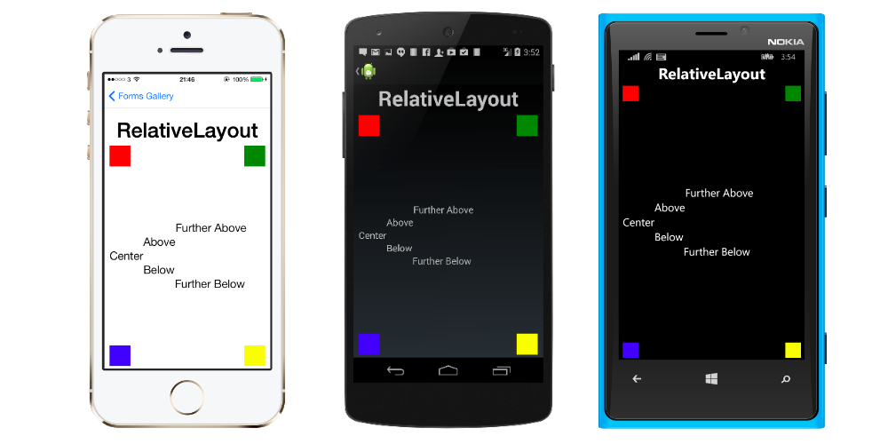
अंतरंग परिस्थिति
एक Layout जो अपने बच्चों को लेआउट करने के लिए Constraints का उपयोग करता है।
RelativeLayout का उपयोग लेआउट या भाई के विचारों के गुणों के सापेक्ष स्थिति और आकार देखने के लिए किया जाता है। AbsoluteLayout विपरीत, RelativeLayout में मूविंग एंकर की अवधारणा नहीं है और इसमें लेआउट के निचले या दाएं किनारों के सापेक्ष पोजिशनिंग तत्वों की सुविधा नहीं है। RelativeLayout पोजिशनिंग तत्वों का समर्थन अपनी सीमा के बाहर करता है।
XAML में एक RelativeLayout इस प्रकार है:
<RelativeLayout>
    <BoxView Color="Red" x:Name="redBox"
        RelativeLayout.YConstraint="{ConstraintExpression Type=RelativeToParent,
            Property=Height,Factor=.15,Constant=0}"
        RelativeLayout.WidthConstraint="{ConstraintExpression
            Type=RelativeToParent,Property=Width,Factor=1,Constant=0}"
        RelativeLayout.HeightConstraint="{ConstraintExpression
            Type=RelativeToParent,Property=Height,Factor=.8,Constant=0}" />
    <BoxView Color="Blue"
        RelativeLayout.YConstraint="{ConstraintExpression Type=RelativeToView,
            ElementName=redBox,Property=Y,Factor=1,Constant=20}"
        RelativeLayout.XConstraint="{ConstraintExpression Type=RelativeToView,
            ElementName=redBox,Property=X,Factor=1,Constant=20}"
        RelativeLayout.WidthConstraint="{ConstraintExpression
            Type=RelativeToParent,Property=Width,Factor=.5,Constant=0}"
        RelativeLayout.HeightConstraint="{ConstraintExpression
            Type=RelativeToParent,Property=Height,Factor=.5,Constant=0}" />
</RelativeLayout>
इस कोड के साथ एक ही लेआउट पूरा किया जा सकता है:
layout.Children.Add (redBox, Constraint.RelativeToParent ((parent) => {
        return parent.X;
    }), Constraint.RelativeToParent ((parent) => {
        return parent.Y * .15;
    }), Constraint.RelativeToParent((parent) => {
        return parent.Width;
    }), Constraint.RelativeToParent((parent) => {
        return parent.Height * .8;
    }));
layout.Children.Add (blueBox, Constraint.RelativeToView (redBox, (Parent, sibling) => {
        return sibling.X + 20;
    }), Constraint.RelativeToView (blueBox, (parent, sibling) => {
        return sibling.Y + 20;
    }), Constraint.RelativeToParent((parent) => {
        return parent.Width * .5;
    }), Constraint.RelativeToParent((parent) => {
        return parent.Height * .5;
    }));
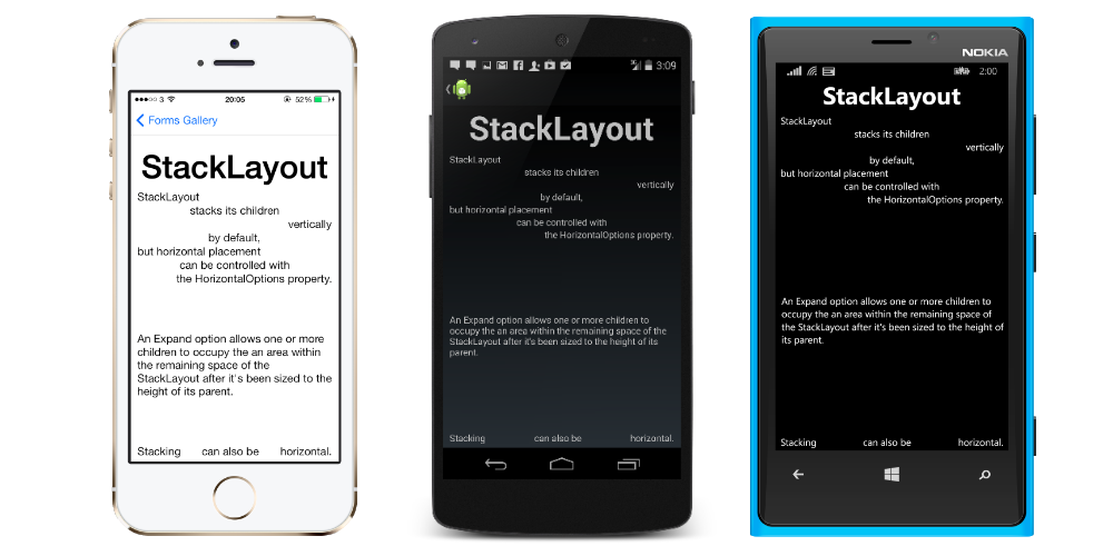
StackLayout
StackLayout एक-आयामी रेखा ("स्टैक") में, या तो क्षैतिज या लंबवत रूप से दृश्य व्यवस्थित करता है। एक StackLayout में Views लेआउट विकल्पों का उपयोग करके लेआउट में अंतरिक्ष के आधार पर आकार StackLayout जा सकता है। पोजिशनिंग को ऑर्डर दृश्यों द्वारा लेआउट और व्यू के लेआउट विकल्पों में जोड़ा गया है।
XAML में उपयोग
<StackLayout>
    <Label Text="This will be on top" />
    <Button Text="This will be on the bottom" />
</StackLayout>
कोड में उपयोग
StackLayout stackLayout = new StackLayout
{
    Spacing = 0,
    VerticalOptions = LayoutOptions.FillAndExpand,
    Children =
    {
        new Label
        {
            Text = "StackLayout",
            HorizontalOptions = LayoutOptions.Start
        },
        new Label
        {
            Text = "stacks its children",
            HorizontalOptions = LayoutOptions.Center
        },
        new Label
        {
            Text = "vertically",
            HorizontalOptions = LayoutOptions.End
        },
        new Label
        {
            Text = "by default,",
            HorizontalOptions = LayoutOptions.Center
        },
        new Label
        {
            Text = "but horizontal placement",
            HorizontalOptions = LayoutOptions.Start
        },
        new Label
        {
            Text = "can be controlled with",
            HorizontalOptions = LayoutOptions.Center
        },
        new Label
        {
            Text = "the HorizontalOptions property.",
            HorizontalOptions = LayoutOptions.End
        },
        new Label
        {
            Text = "An Expand option allows one or more children " +
                   "to occupy the an area within the remaining " +
                   "space of the StackLayout after it's been sized " +
                   "to the height of its parent.",
            VerticalOptions = LayoutOptions.CenterAndExpand,
            HorizontalOptions = LayoutOptions.End
        },
        new StackLayout
        {
            Spacing = 0,
            Orientation = StackOrientation.Horizontal,
            Children =
            {
                new Label
                {
                    Text = "Stacking",
                },
                new Label
                {
                    Text = "can also be",
                    HorizontalOptions = LayoutOptions.CenterAndExpand
                },
                new Label
                {
                    Text = "horizontal.",
                },
            }
        }
    }
};