twitter-bootstrap-3
Tasten
Suche…
Parameter
| Klasse | Beschreibung |
|---|---|
| BT-Standard | Standardtaste. @ brand-default: #fff |
| BTN-Primär | Bietet zusätzliches visuelles Gewicht und identifiziert die primäre Aktion. @ brand-primary: dunkler (# 428bca, 6,5%); |
| BT-Erfolg | Wird verwendet, um eine erfolgreiche Aktion anzuzeigen. @ brand-success: # 5cb85c; |
| BTN-Info | Kontext-Schaltfläche zum Bereitstellen von Informationen. @ brand-info: # 5bc0de; |
| BT-Warnung | Zeigt an, dass der Benutzer vorsichtig sein sollte. @ Markenwarnung: # f0ad4e; |
| BTN-Gefahr | Weist auf eine gefährliche oder negative Aktion hin. @ brand-danger: # d9534f; |
| BTN-Link | Verwenden Sie für den Link. |
Schaltflächentypen
<button class="btn btn-default" type="button">Default</button>
<button class="btn btn-primary" type="button">Primary</button>
<button class="btn btn-success" type="button">Success</button>
<button class="btn btn-info" type="button">Info</button>
<button class="btn btn-warning" type="button">Warning</button>
<button class="btn btn-danger" type="button">Danger</button>

<a class="btn btn-default" href="#" role="button">Link</a>
<button class="btn btn-default" type="submit">Button</button>
<input class="btn btn-default" type="button" value="Input">
<input class="btn btn-default" type="submit" value="Submit">
Knopfgröße
Die Klasse für die Größenschaltfläche Bootstrap lautet
.btn-lg
.btn-md
.btn-sm
.btn-xs
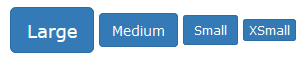
Zum Beispiel :
<button type="button" class="btn btn-primary btn-lg">Large</button>
<button type="button" class="btn btn-primary btn-md">Medium</button>
<button type="button" class="btn btn-primary btn-sm">Small</button>
<button type="button" class="btn btn-primary btn-xs">XSmall</button>
Modified text is an extract of the original Stack Overflow Documentation
Lizenziert unter CC BY-SA 3.0
Nicht angeschlossen an Stack Overflow